Stamp It!
Day 3, February 25, 2015
Lesson Description
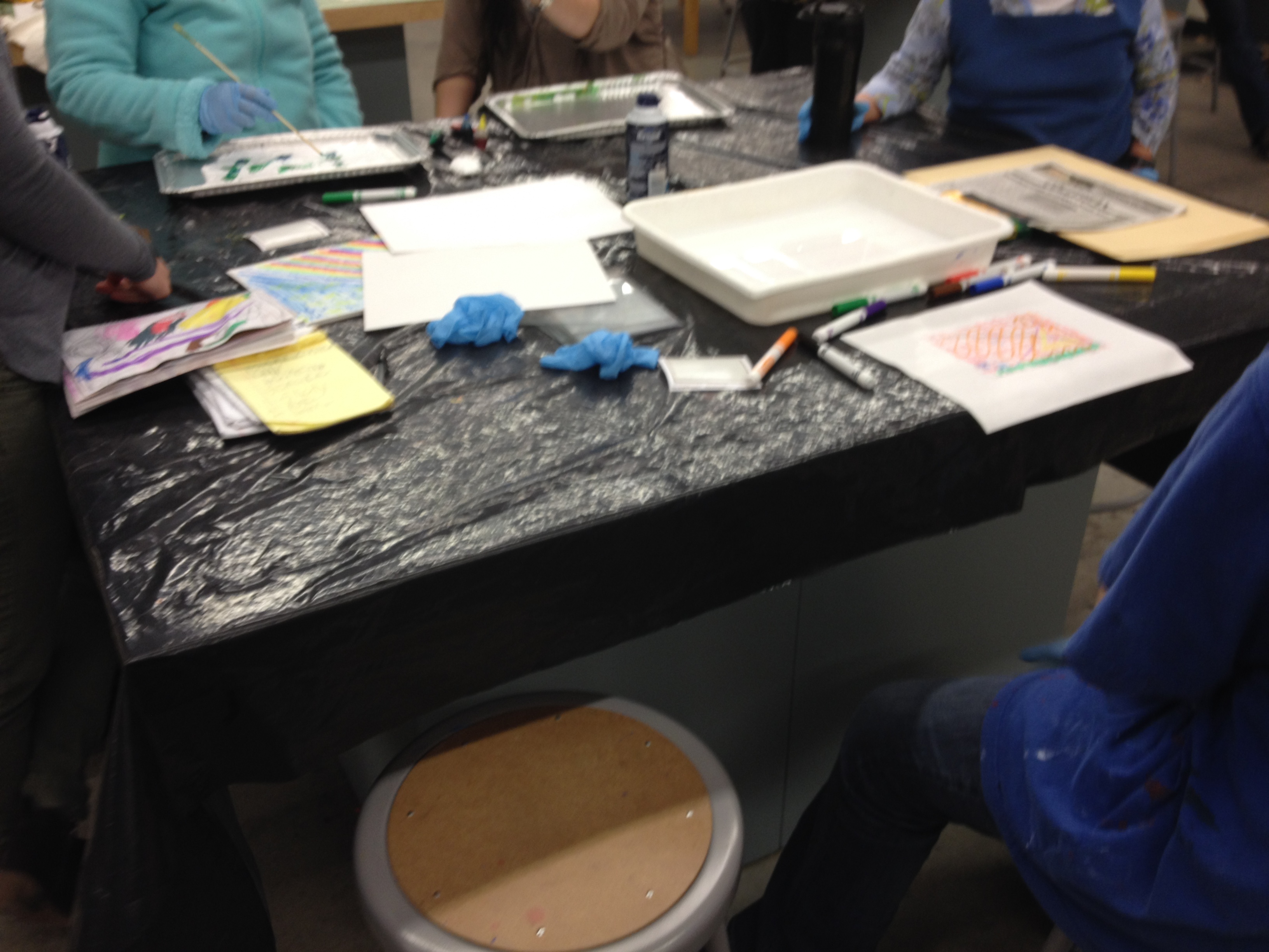
In today’s lesson, students will use stamp printmaking technique to stamp motifs previously used in lessons. Students will compare and contrast their painted/ drawn motifs to their stamped motif. Students will use different materials to change the meaning of images.
Key Concepts
Printmaking, Stamps, Intent, Compare/ contrast
Enduring Understanding
–Collaging art materials is a way of recreating meaning and image representation.
Objectives
- The student will be able to recreate a favorite motif using a stamp. (Art Materials/ Technique)
- The student will be able to use printmaking vocabulary to talk about motifs in art. (Expressive Features/ Characteristics of Art)
- The student will be able to use drawing, painting, and stamping to collage their motif. (Art Materials/ Technique)
- The student will be able to carve their motif on a stamp.(Art Materials/ Technique)
- The student will be able to use a benchhook, v and u gauge tools to cut a print plate in fine art making. (Art History/ Culture)
- The student will be able to brainstorm motifs and ideas in their sketchbook. (Literacy, Concept/Ideation)
- The student will be able to verbally compare and contrast their drawn/painted motif and their stamped motif. (Reflection/Assessment)
Skills
-Correctly using U and V gauge tools to carve a stamp
-Compare and contrast works of art
-Create an art composition using printmaking techniques (stamping)
Art Focus (content)
Printmaking,
In today’s learning experience students…
When Nick points out the Nick’s process exemplified Koster’s definition of art as graphic, verbal, and kinesthetic expression.
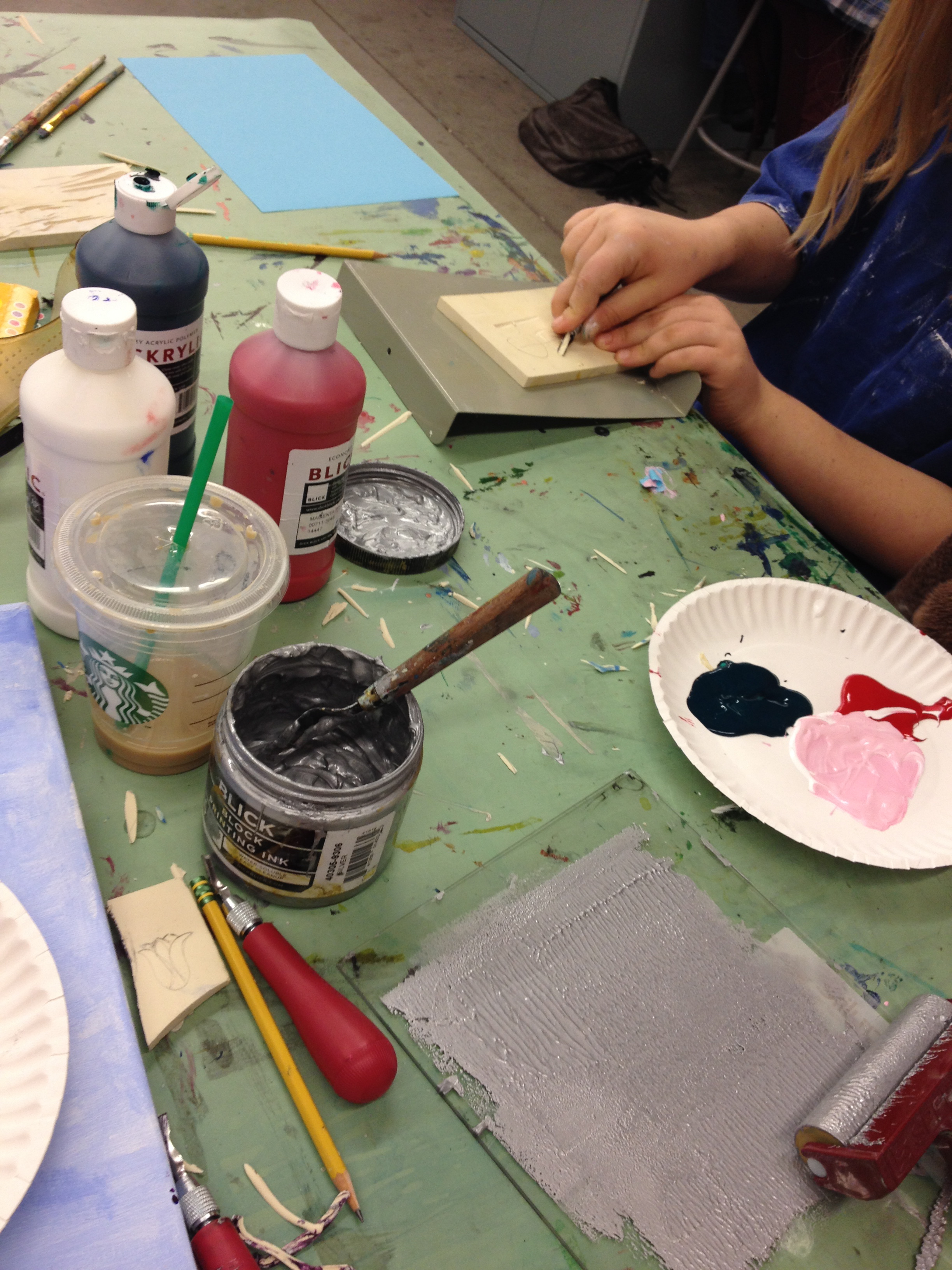
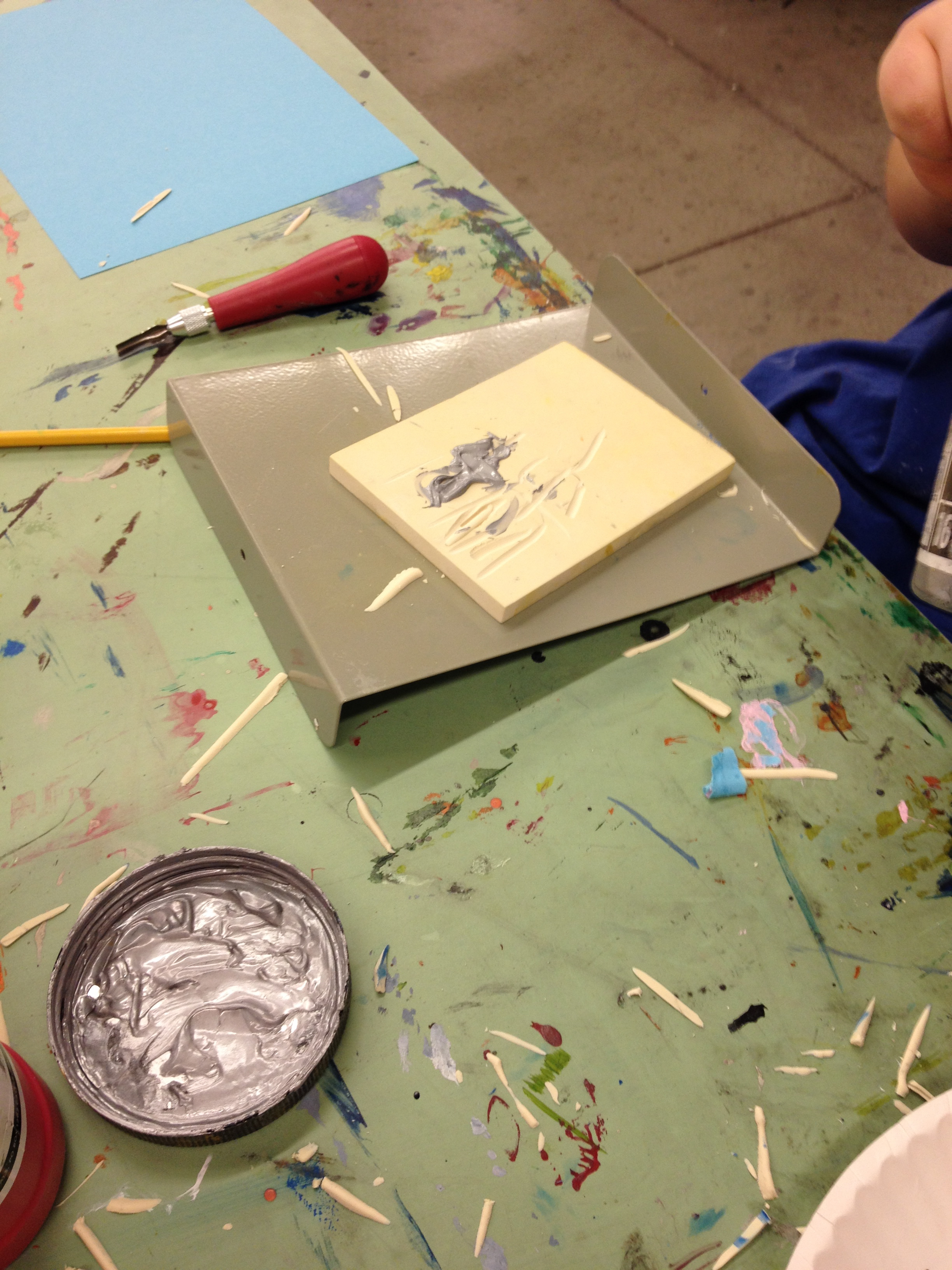
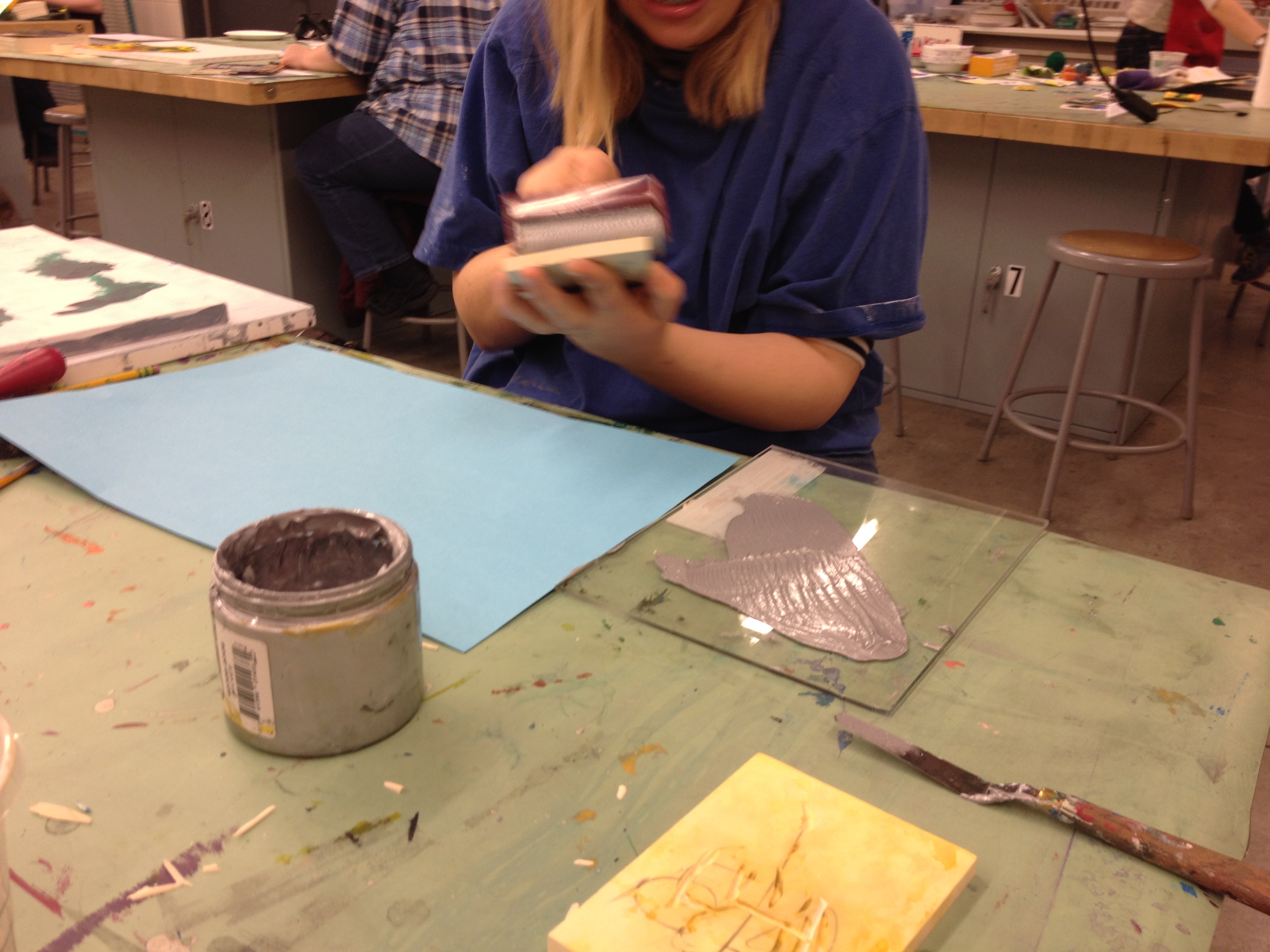
While Ashley was carving her stamp, she started out duplicating the flowers she had been creating in her paintings. While she was using a U-gauge, she realized when she tried to make large cuts she had less control and could not follow her lines. She immediately adjusted her motions to be smaller and had more control of her design!
When it was time to print she chose silver with a bright blue background!
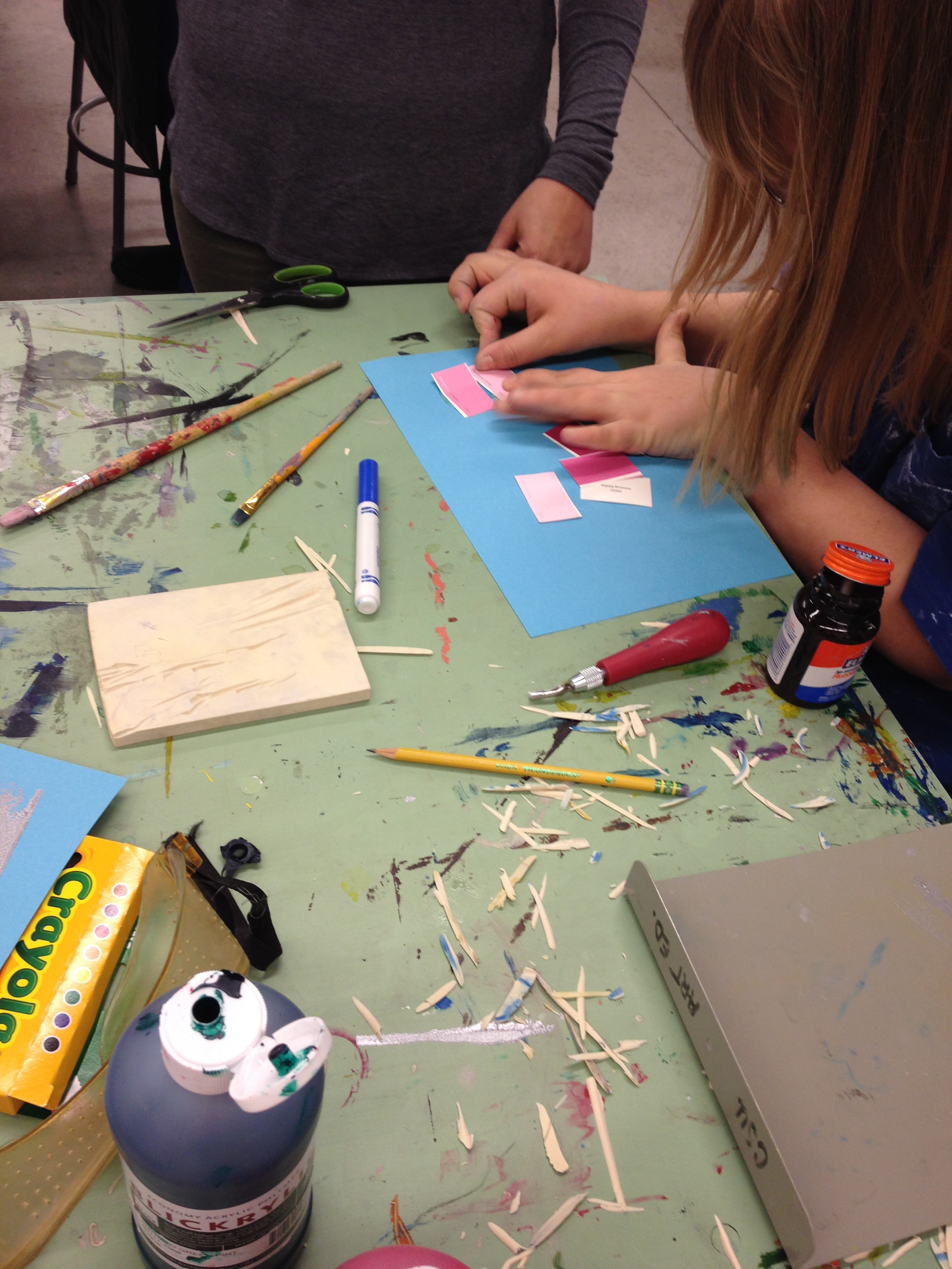
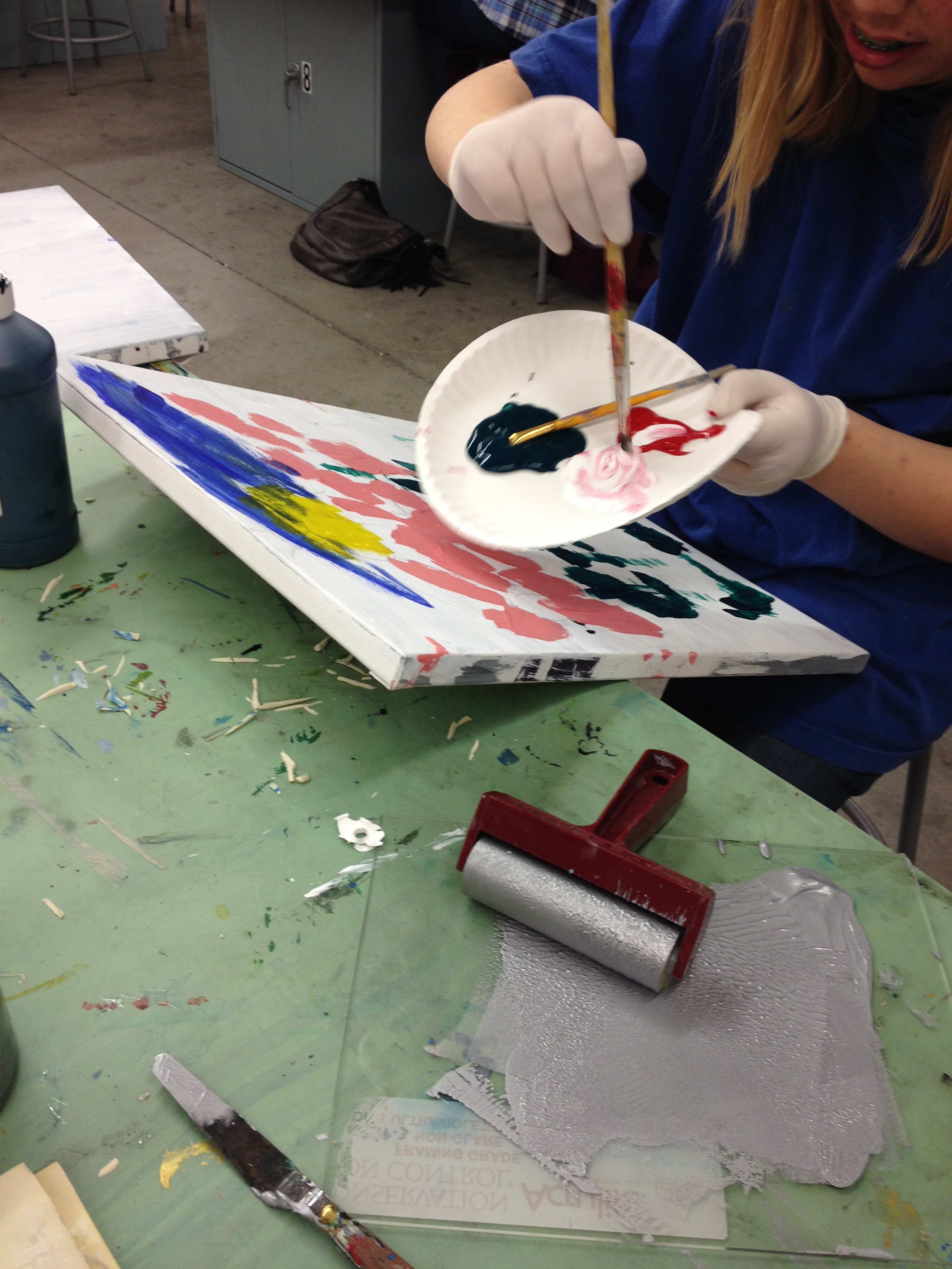
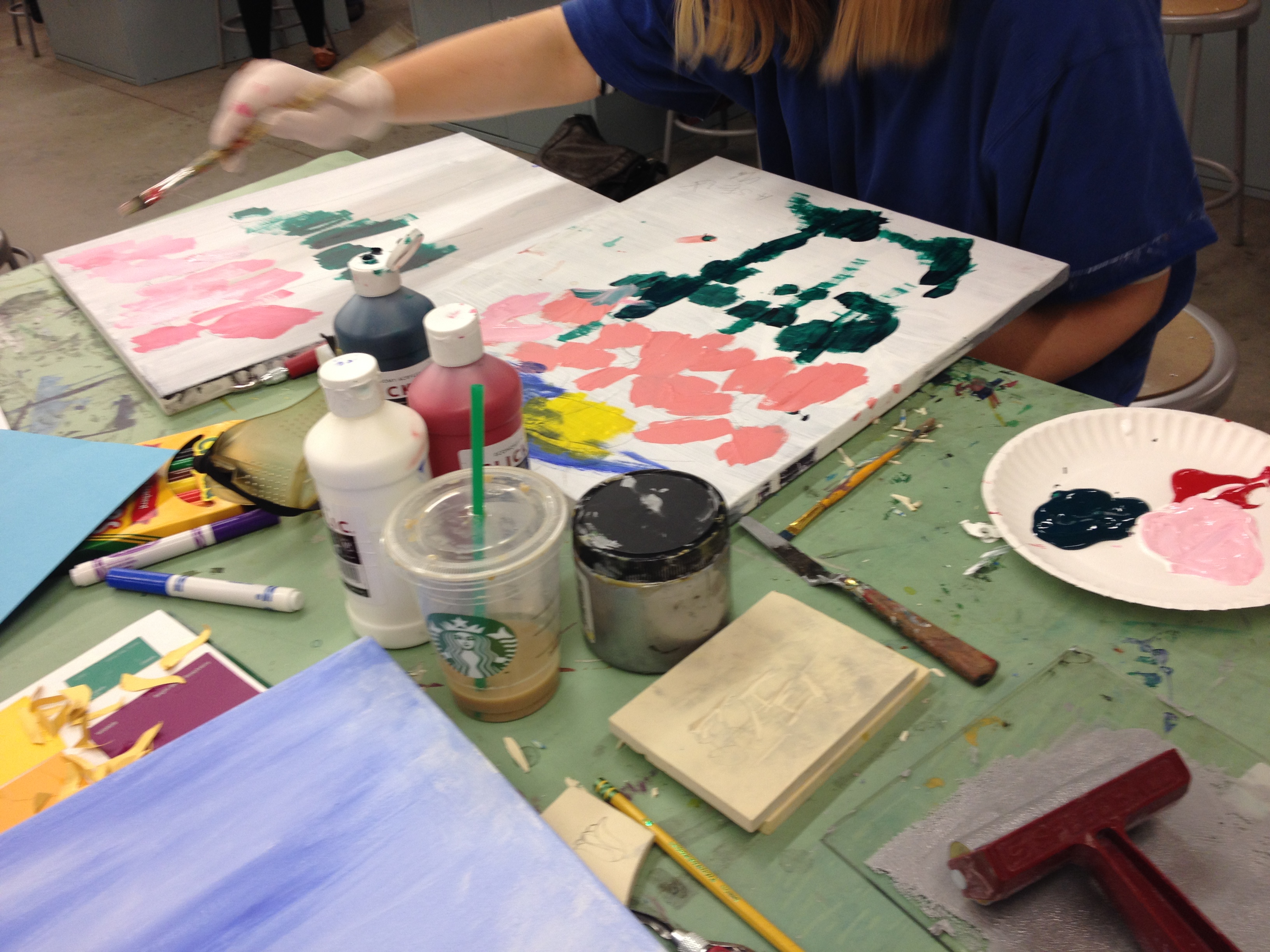
Every class period, Ashley works on two flower paintings a little more, this week she added more green leaves. Ashley also mixed her own pink, and discovered if she added more red than white, it became a darker pink than she used last week! She decided to use the darker pink in addition to her original pink to add more variety to her composition.
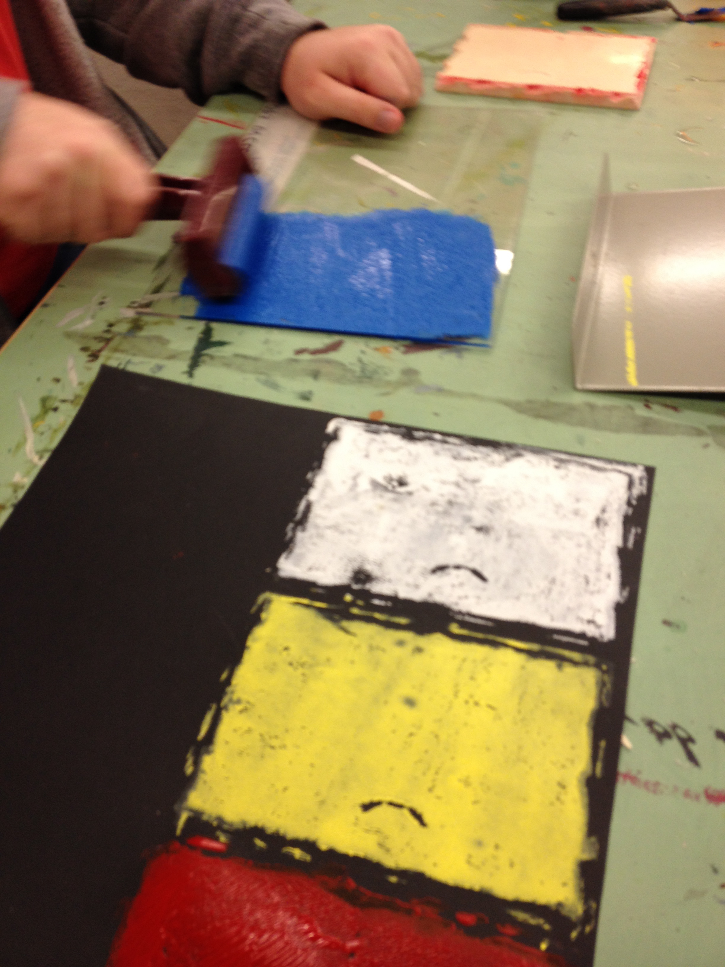
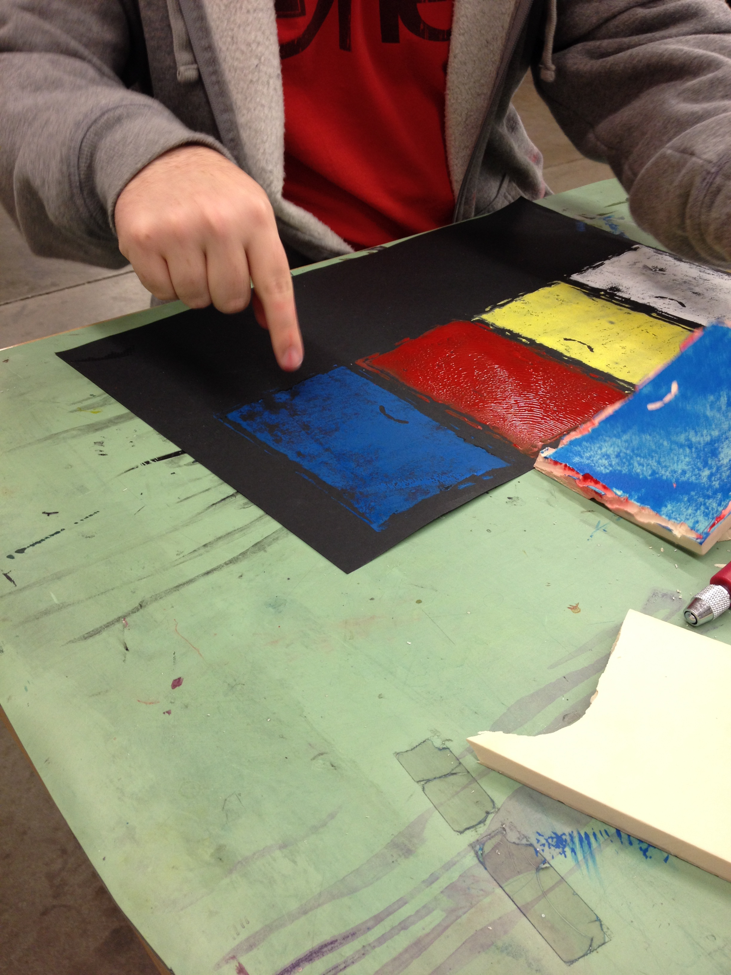
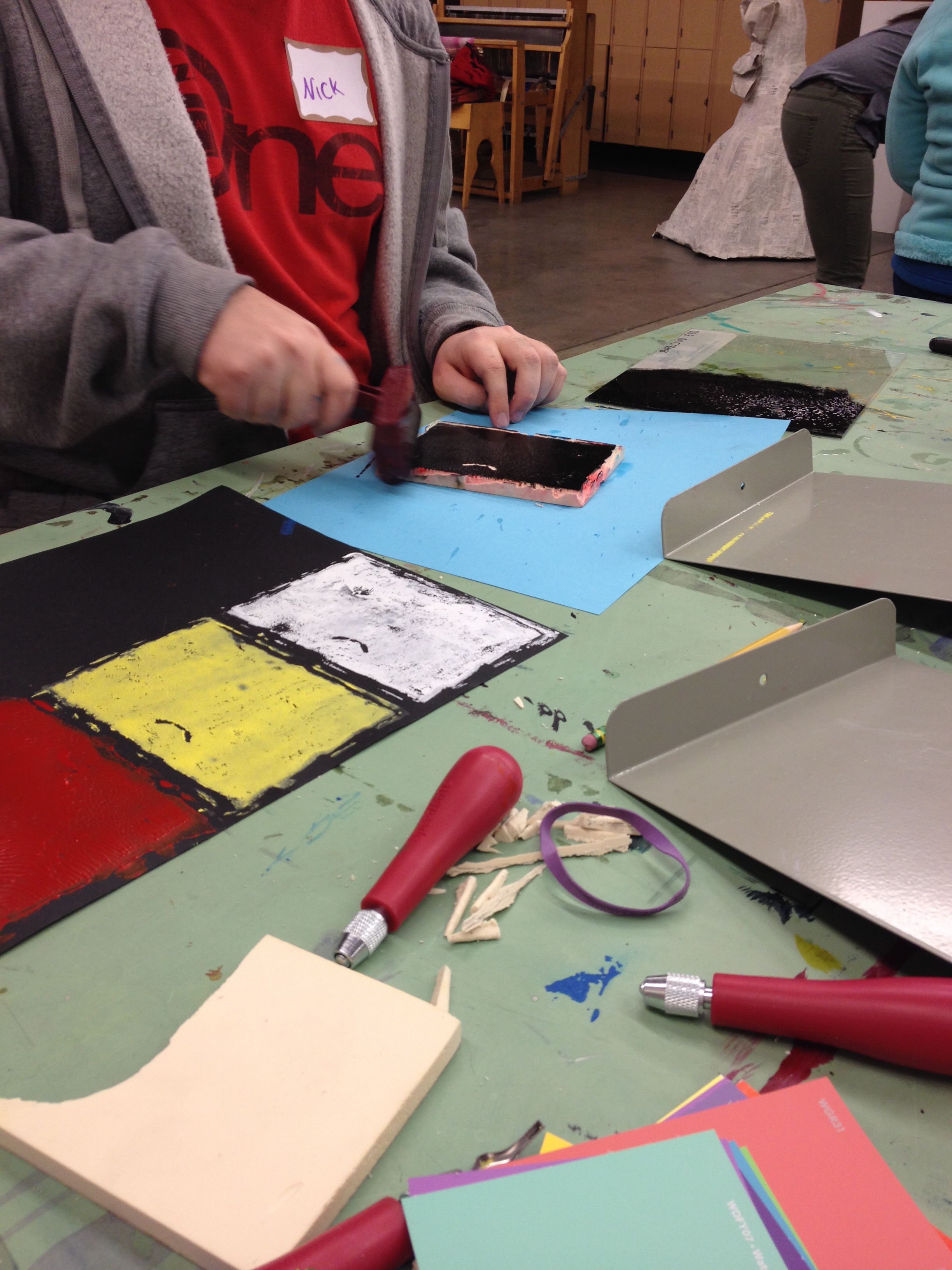
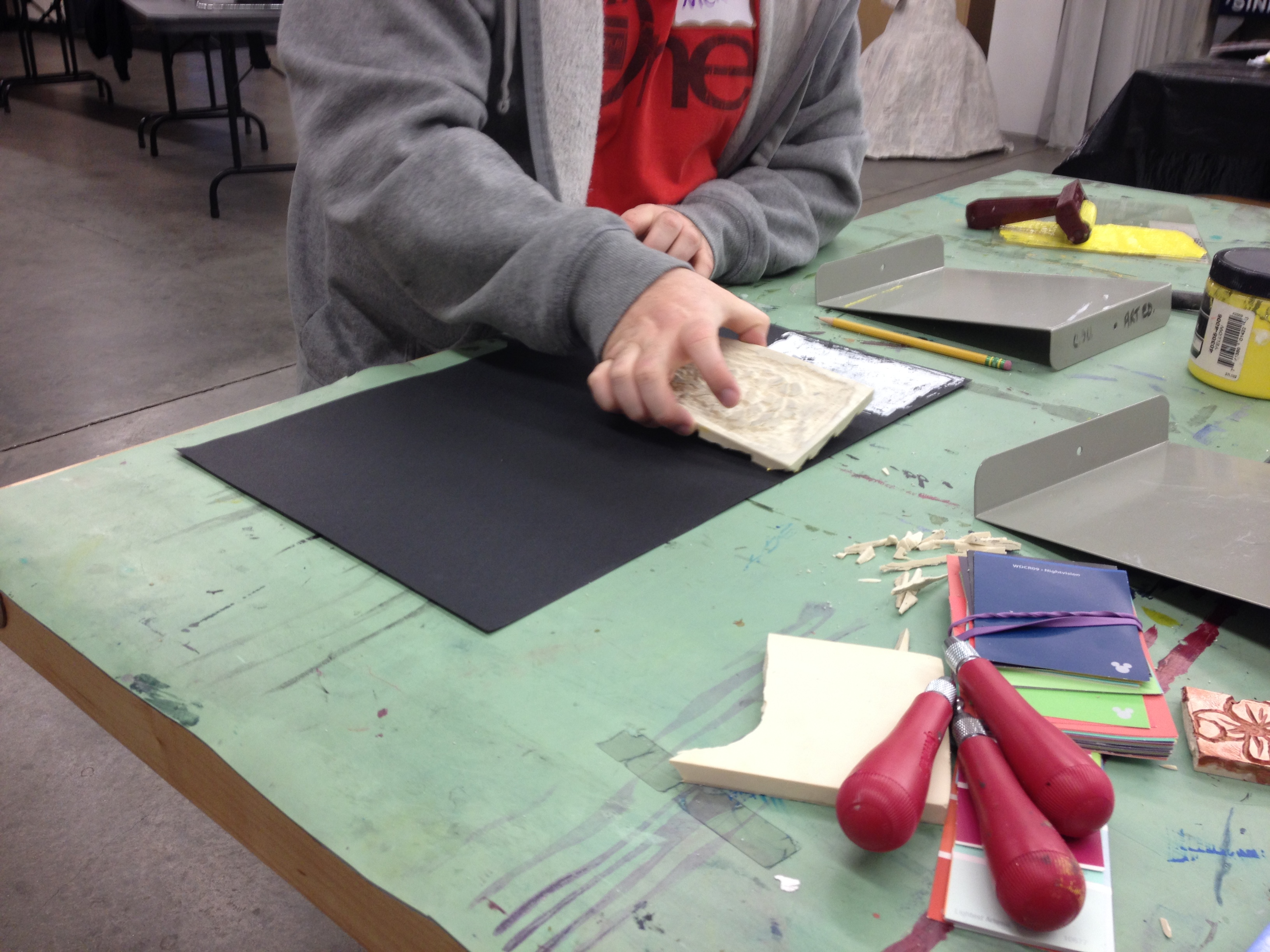
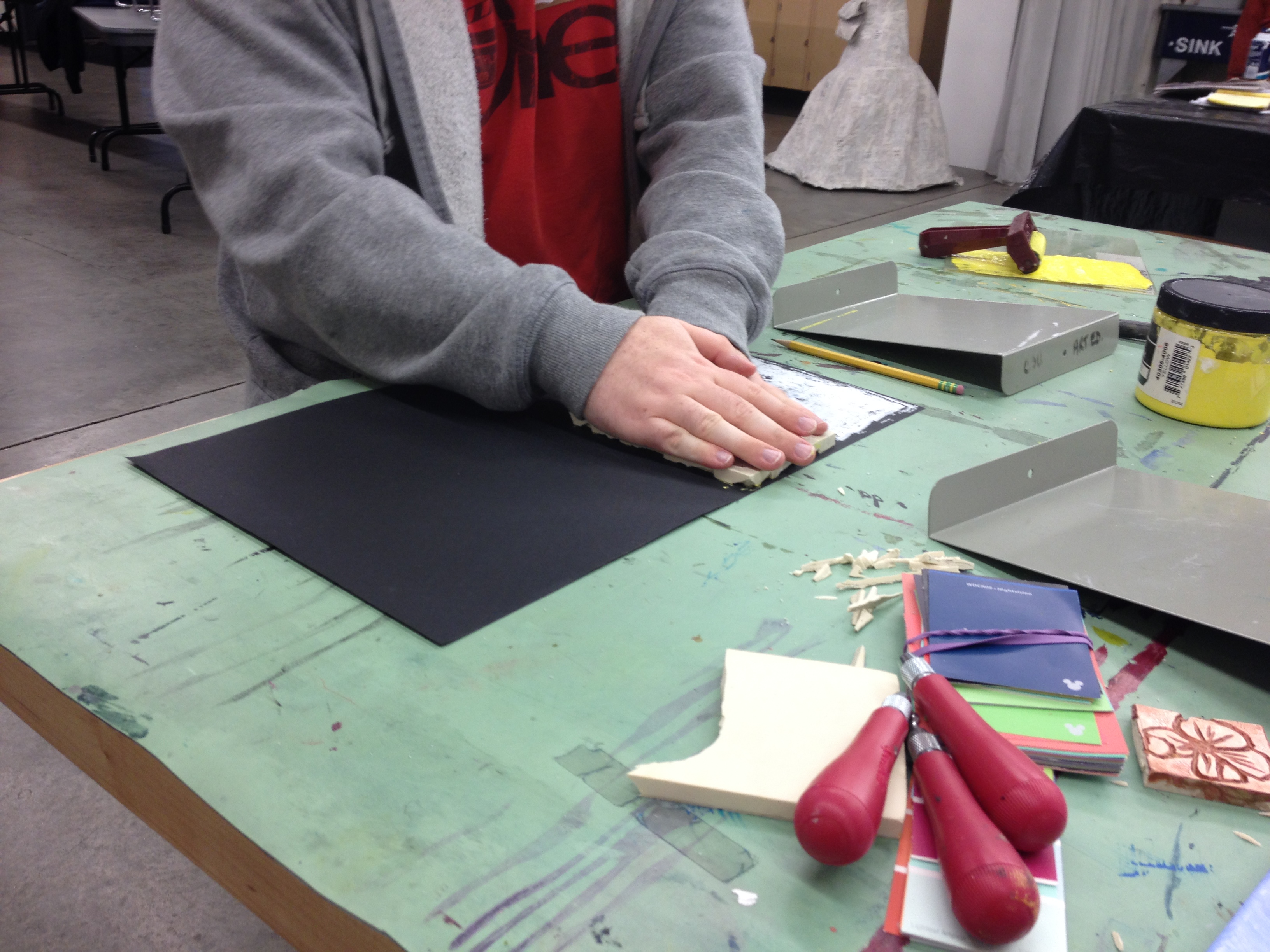
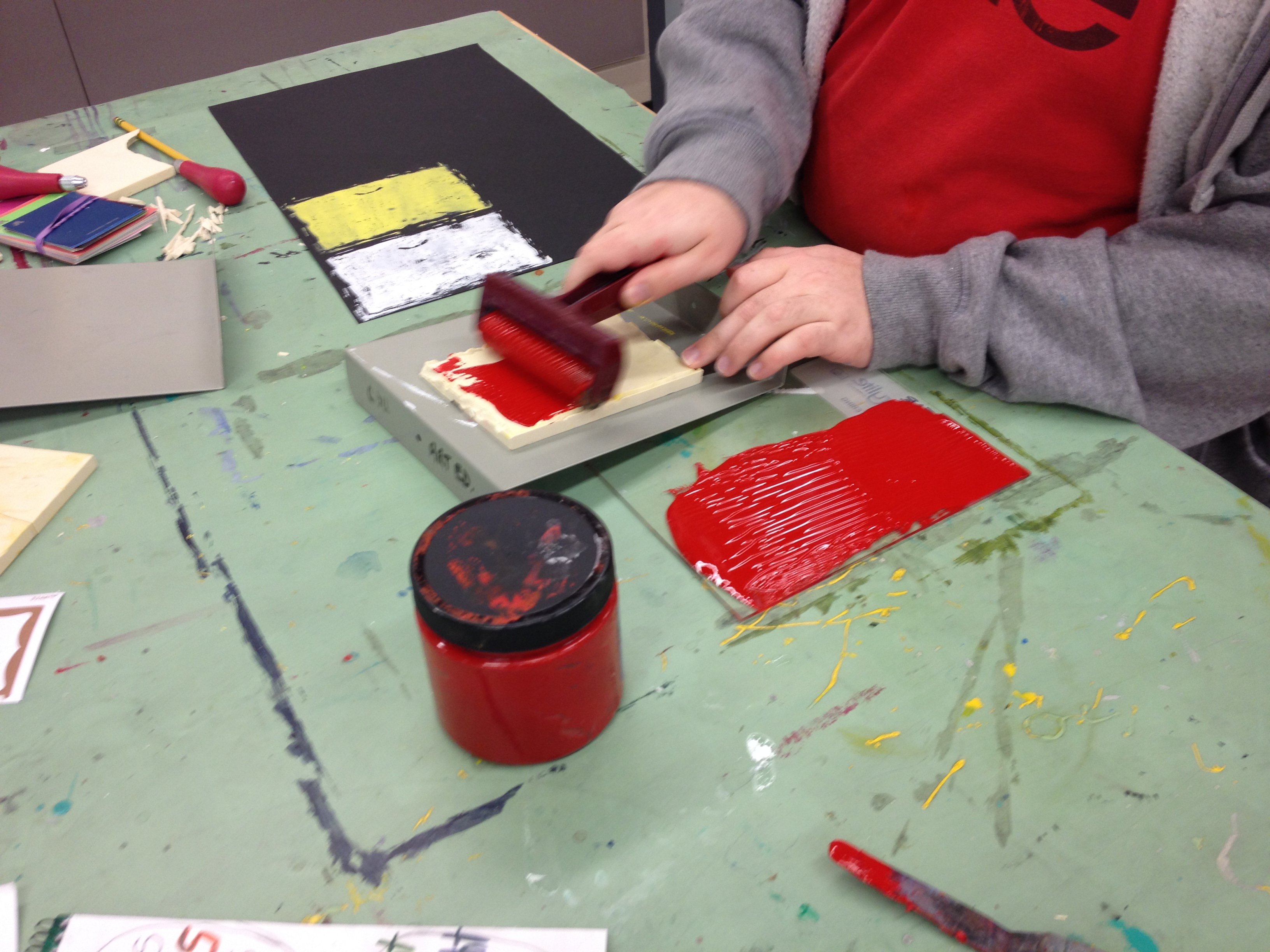
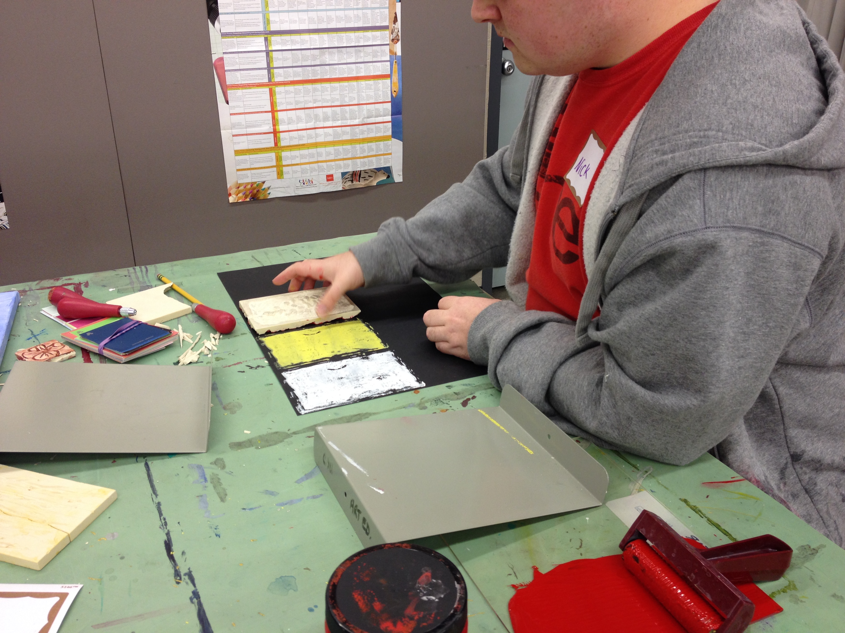
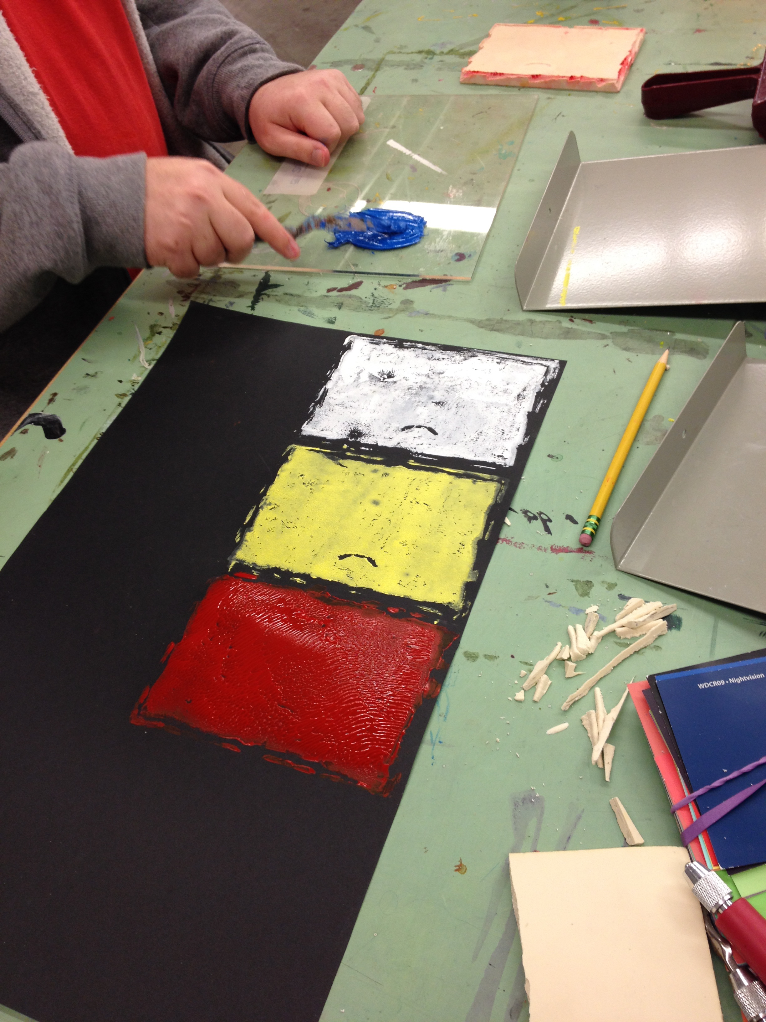
Nick printing his stamps:
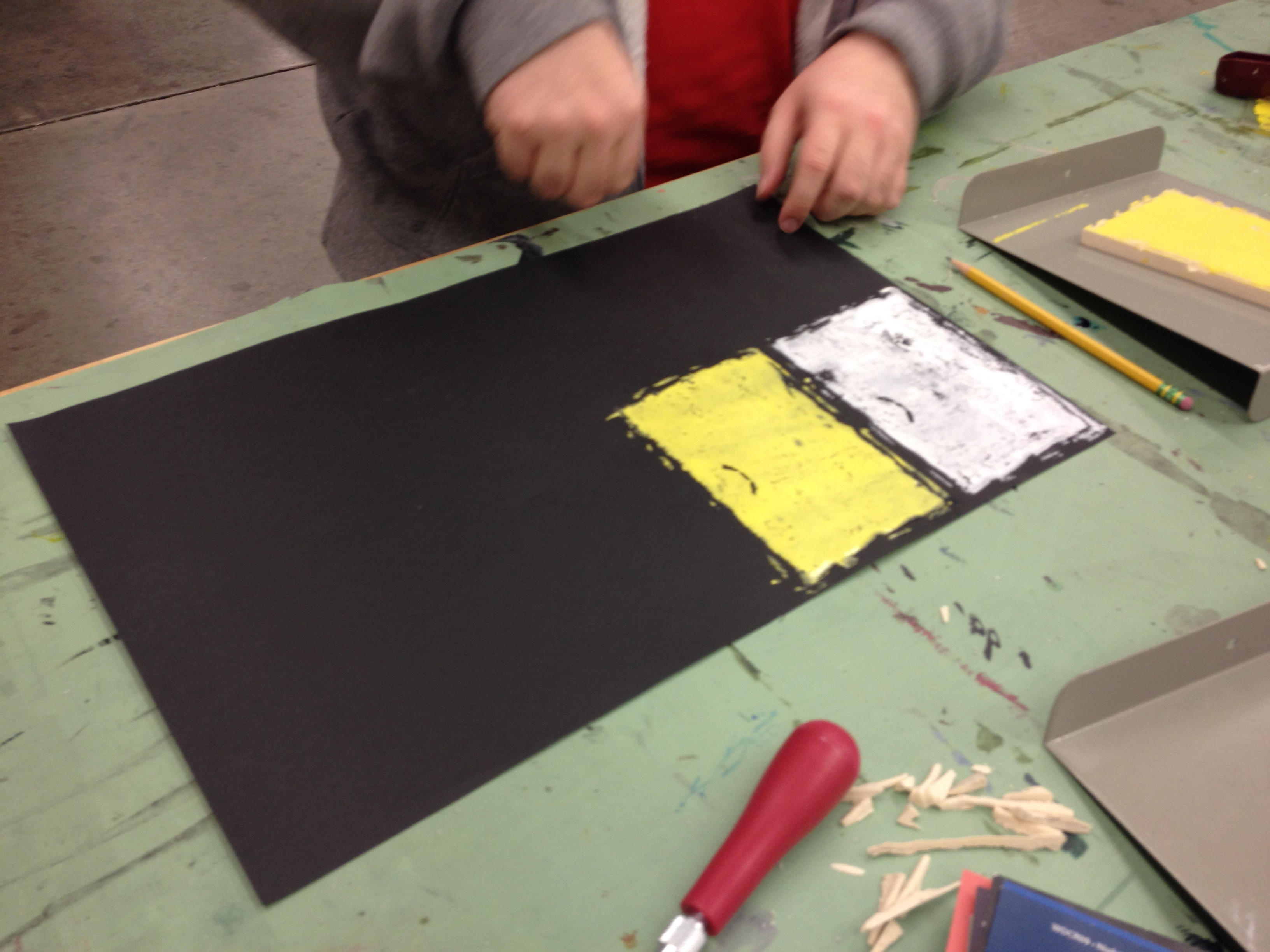
Nick started out with black paper, and chose his ink color based on his own experiment. Nick wanted to find out which ink colors would show up on black paper.
First he chose what he informed me was “the absence of color, and the opposite of black,” white! He theorized that because white is the opposite of black and is so much brighter it would pint very clearly.
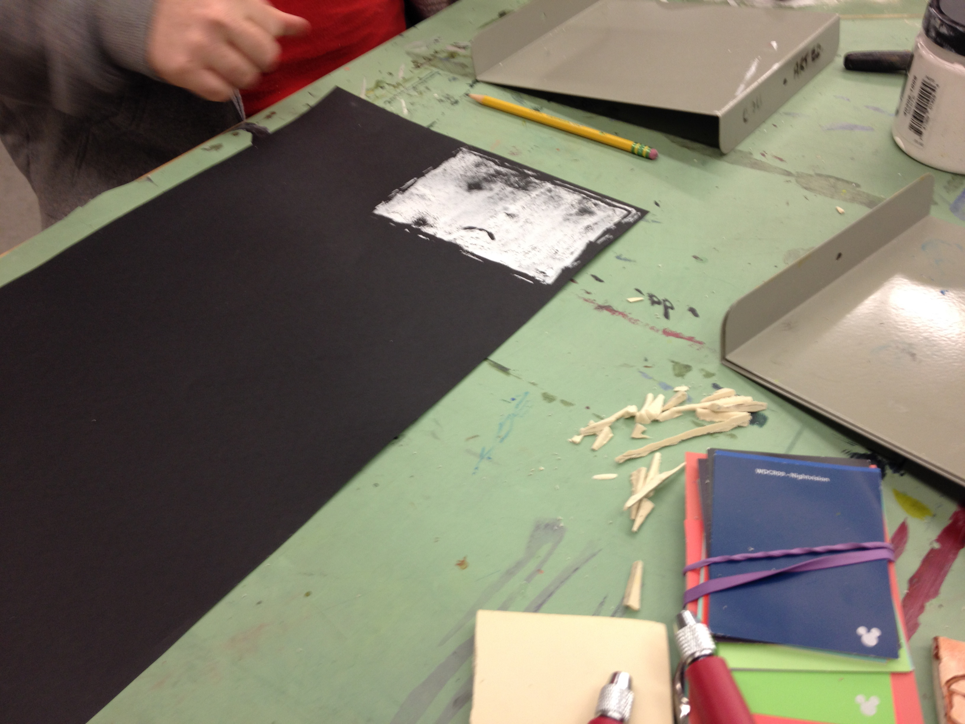
After he printed white he realized it did not print very clearly. By examining his print Nick was able to infer that he had not put enough paint on his stamp, and had not pressed down hard enough. He decided that on his next stamp he would tap it down harder.
Next, Nick chose to print yellow, because it is also much brighter than black.
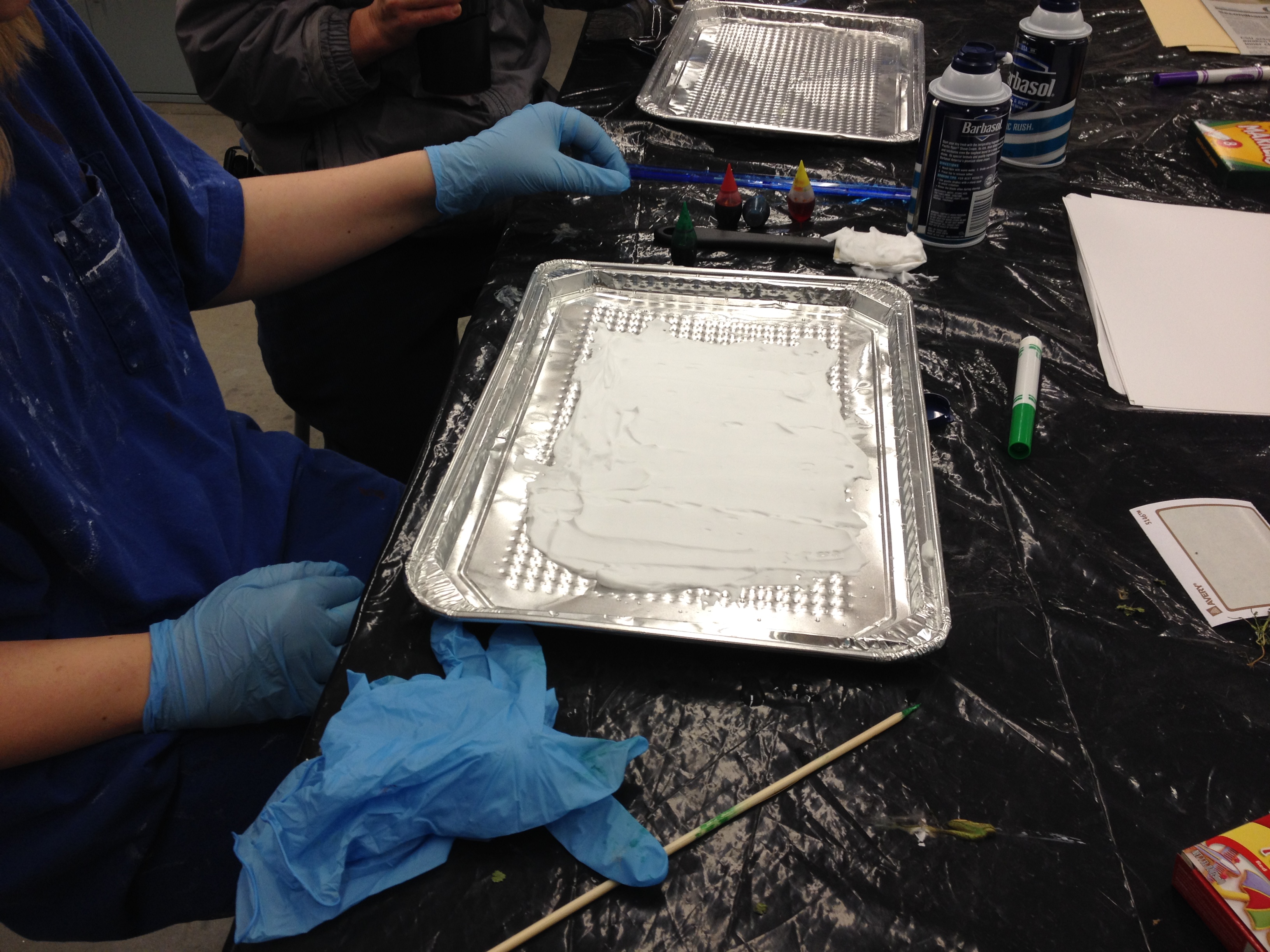
After stamping for a while Ashley wanted to see what was happening at Jenna Mishoe’s station, we could smell some kind of crazy shaving cream over there!
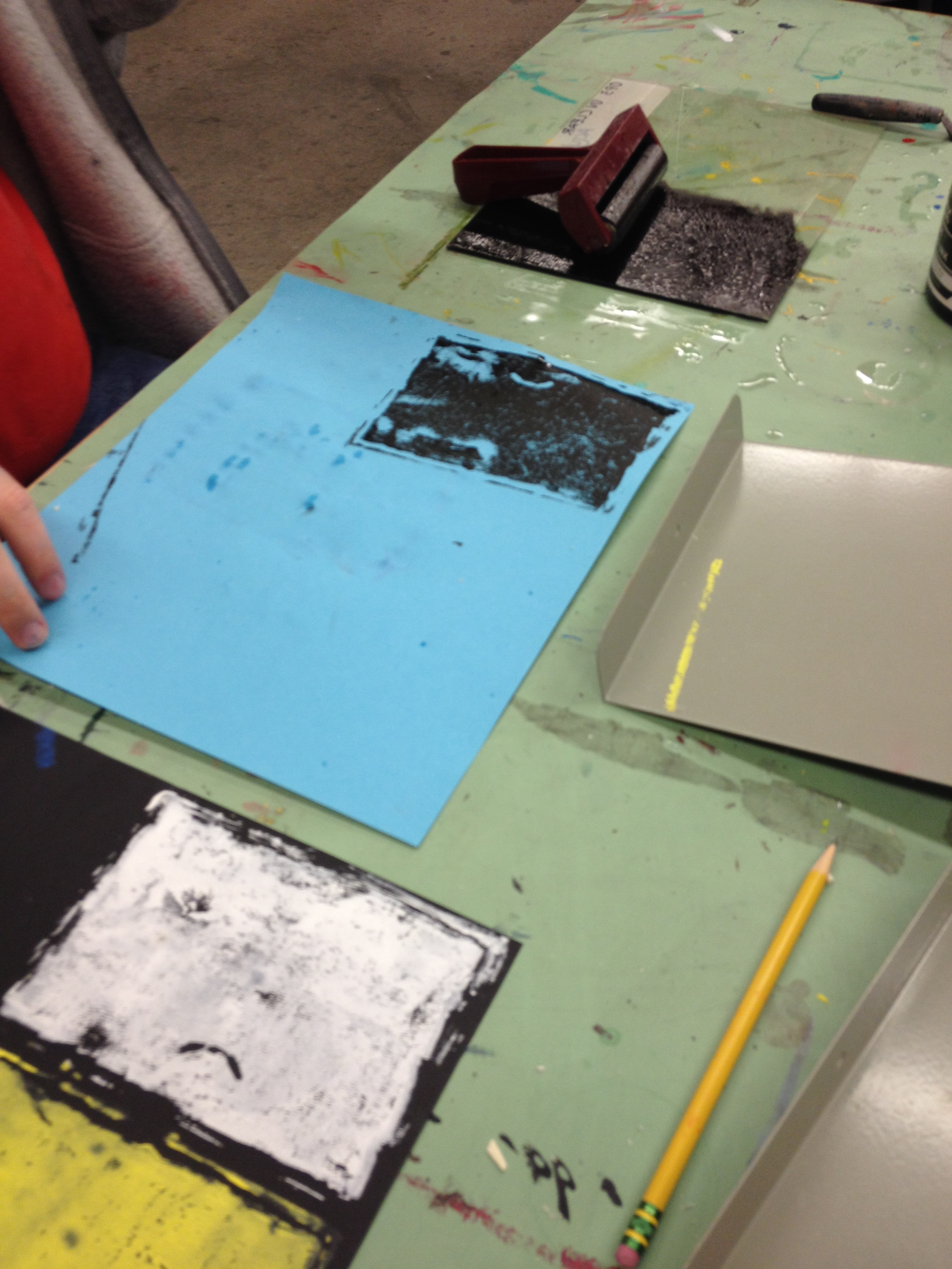
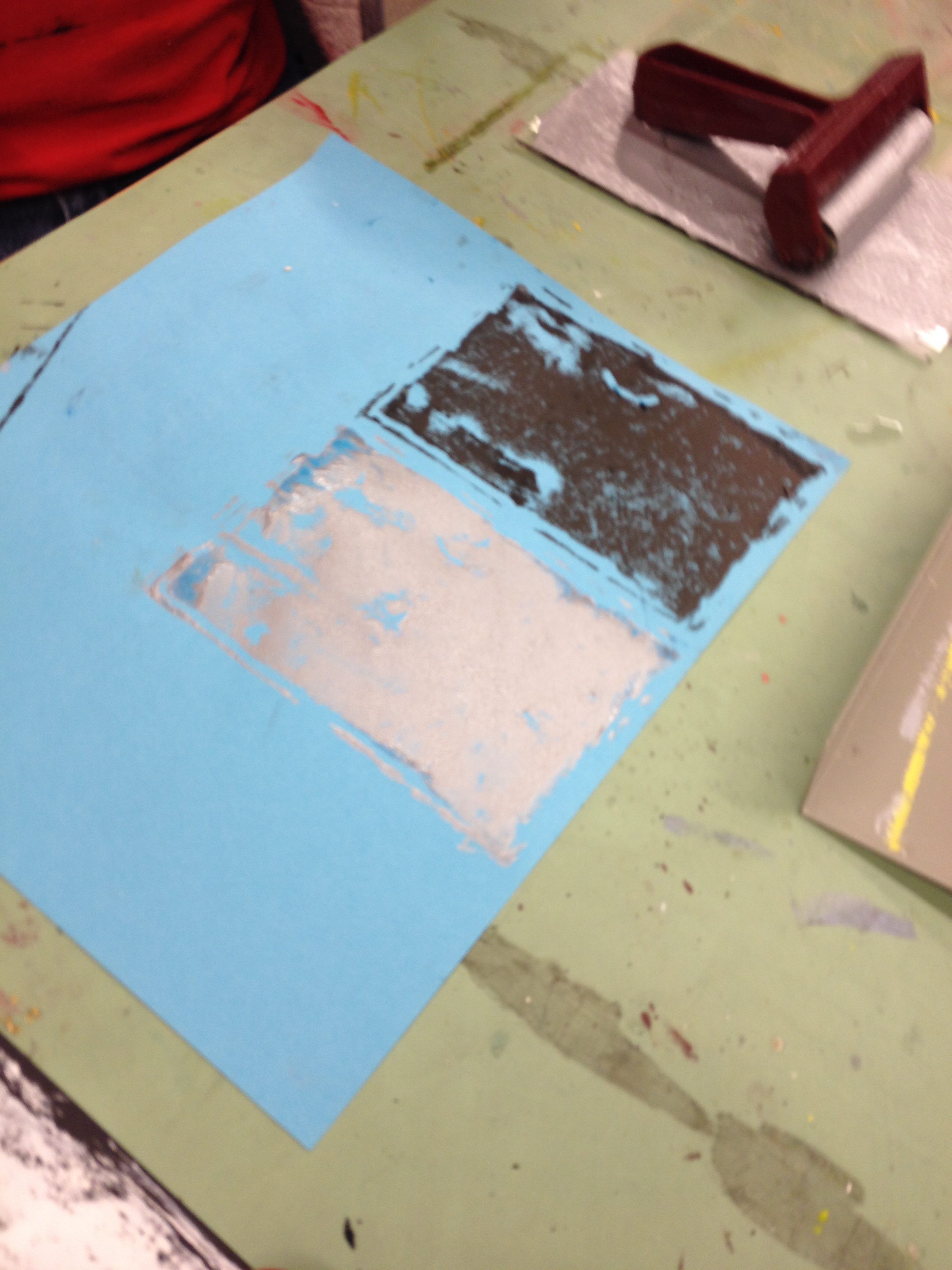
Nick methodically printed primary colors on black paper, hypothesizing which colors would show up the best. When it came to black ink and and silver, Nick decided they would show up better on blue paper.
Ashley carved her ever present flowers on her stamp.