Abstract Colors!
Day 4, March 4, 2015
Lesson Description
Students will create an abstract painting that represents an emotion using tape-line-resist methods.
This lesson is important for students because if helps students understand the connection between art and emotion and between expressive characteristics/ features of art (such as color) and emotion. Establishing this connection and providing opportunities to analyze it exercises higher level thinking for critical learning.
These students are interested in including a variety of colors in their art, but have shown so far that they find more formal art techniques intimidating. The tape-line-resist method provides students a safe format to experiment with colors. It also incorporates left-brain activities for those students like Nick who enjoy working analytically with geometry. This activity is also relevant for students like Ashley because it provides a new format (abstract art) for students who may consistently choose the same form (flowers).
Key Concepts
Line, Color, Resist process, Abstract, Mixing colors
Enduring Understanding
–Collaging art materials is a way of recreating meaning and image representation.
-Abstract shapes can represent emotions.
Objectives
- Students will be able to understand and recognize steps in their art making process, and explain them verbally and in writing. (Literacy)
- Using specific colors and shapes, the student will be able to express a chosen emotion in their abstract painting. (Expressive Features/ Characteristics of Art)
- The student will be able to use taped lines and layers of paint to create an abstract composition. (Art Materials/Technique)
- Looking at the art of Kandinsky, Pinajian, and Gerhard Richter students will identify emotions associated with the works. (Art history/ Culture)
- Using the experiment worksheet students will be able to reflect on their process, as well as summarize the theme of their piece. (Reflection/Assessment)
- Students will be able to hypothesize what their art will look like using an experiment worksheet. (Concept/Ideation)
Skills
Understanding resist processes, color mixing, visually reading images
Art Focus (content)
Tape-Resist-Painting, Abstract Art
See what we did!…
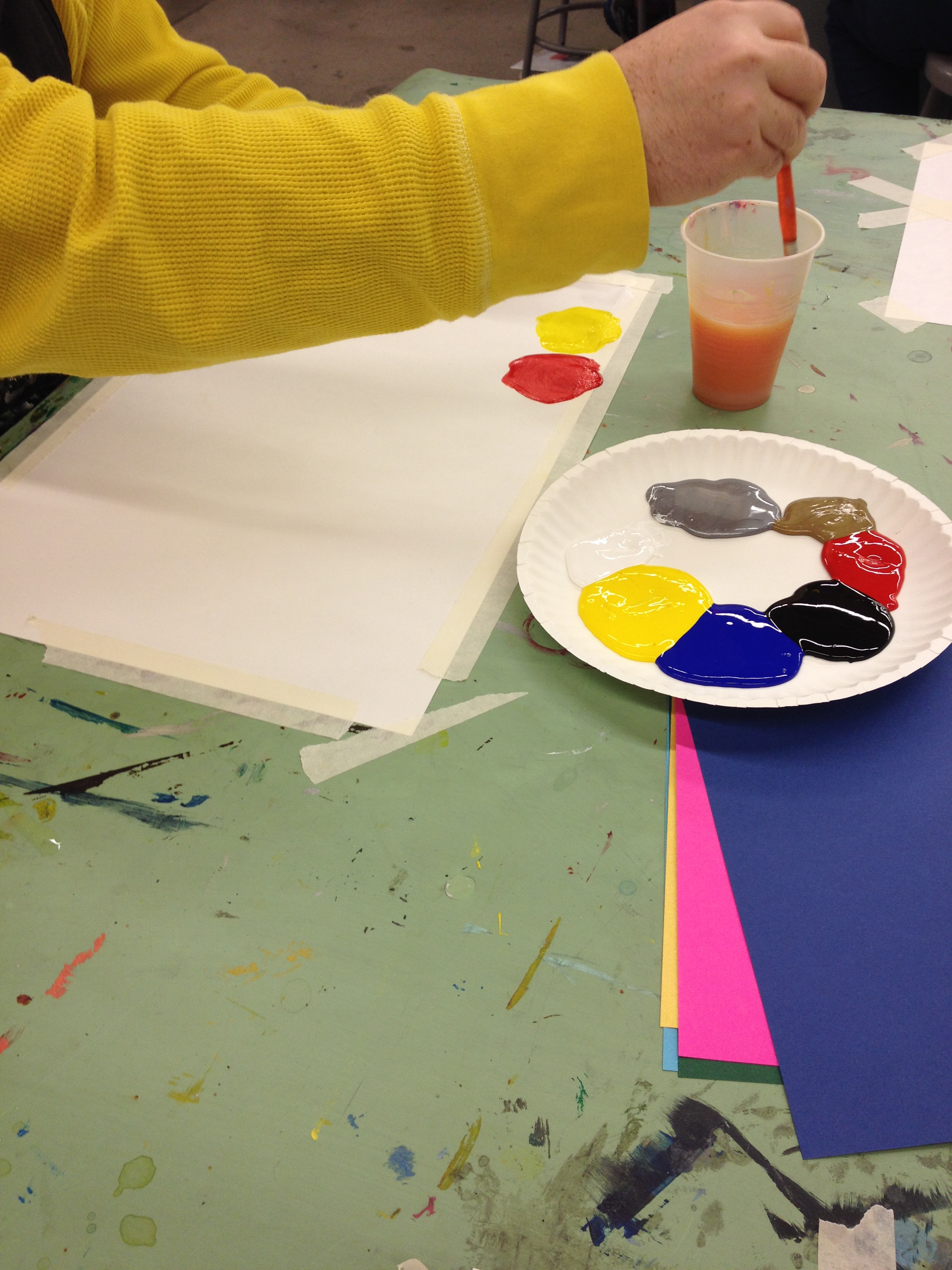
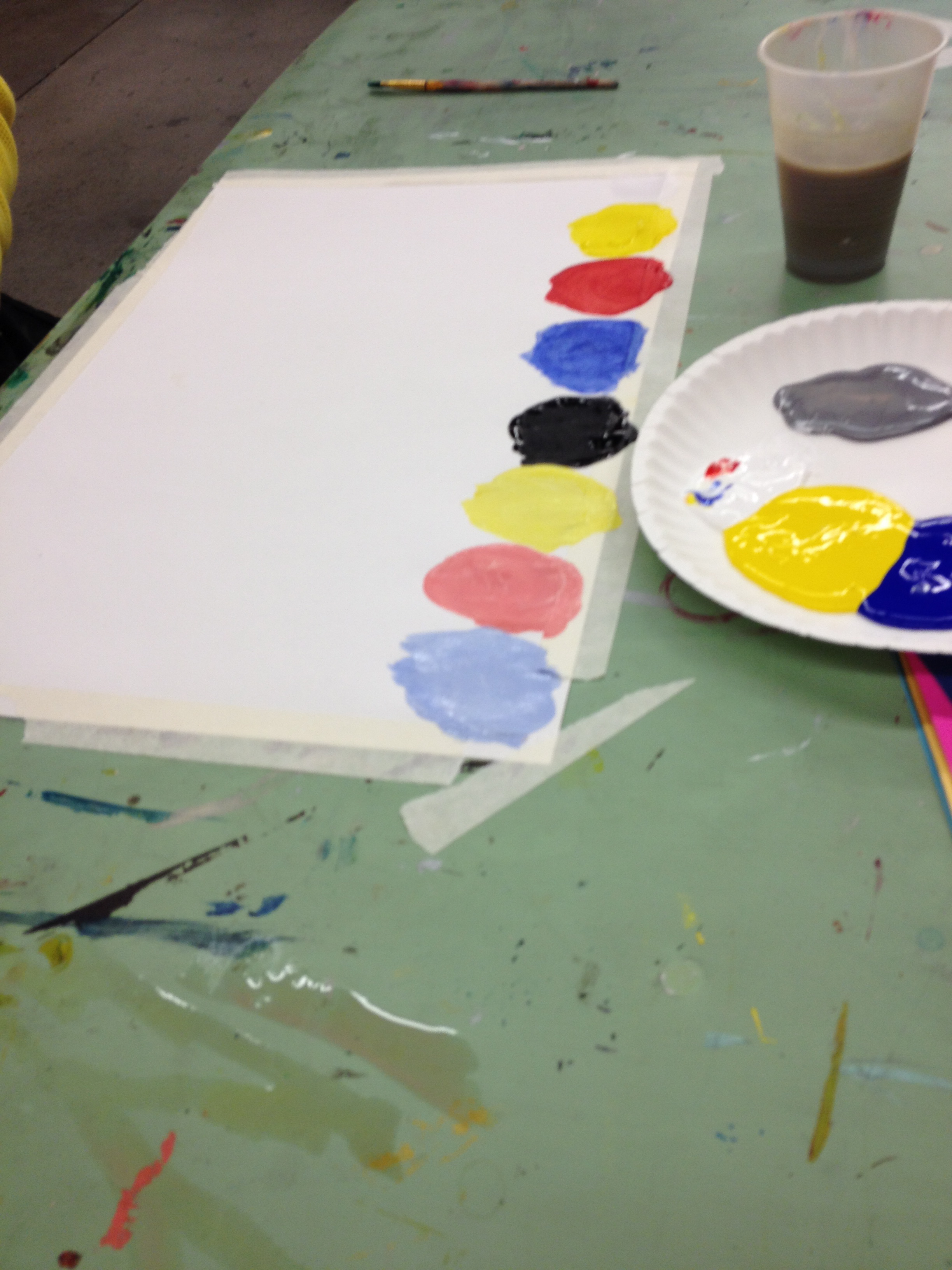
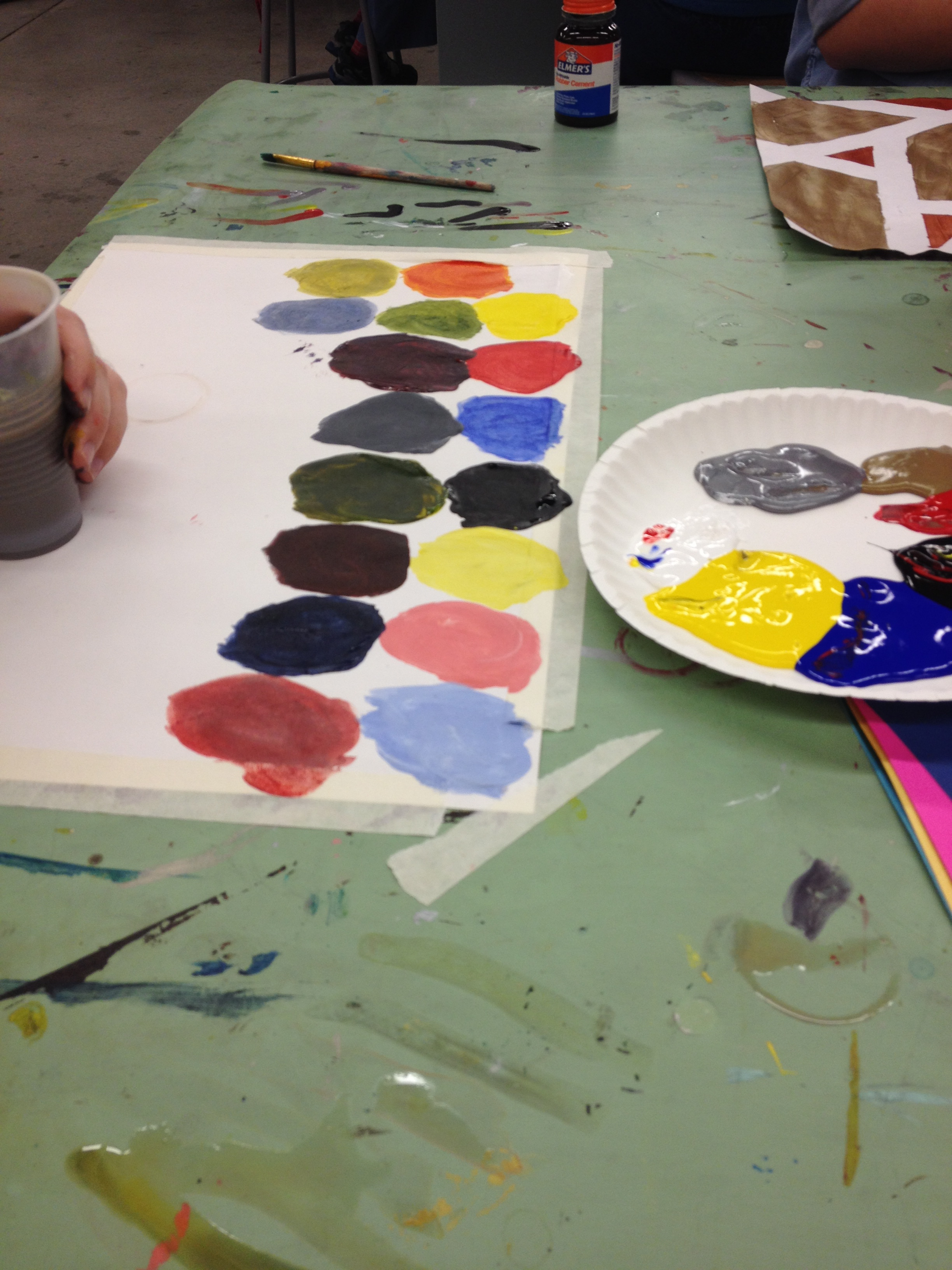
Nick- Primary colors and metallics
Nick started by demonstrating what the primary colors straight out of the bottle looked like.
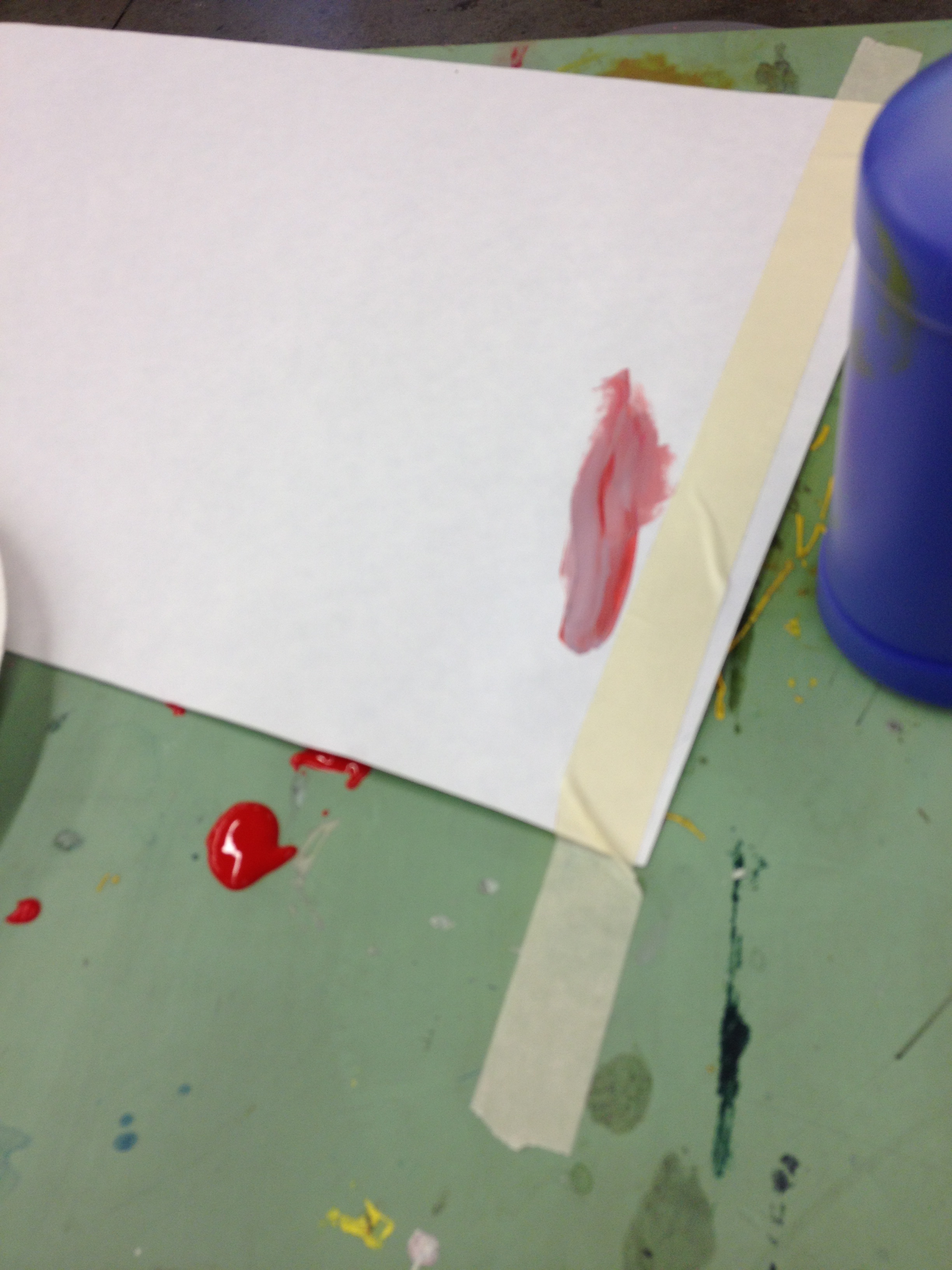
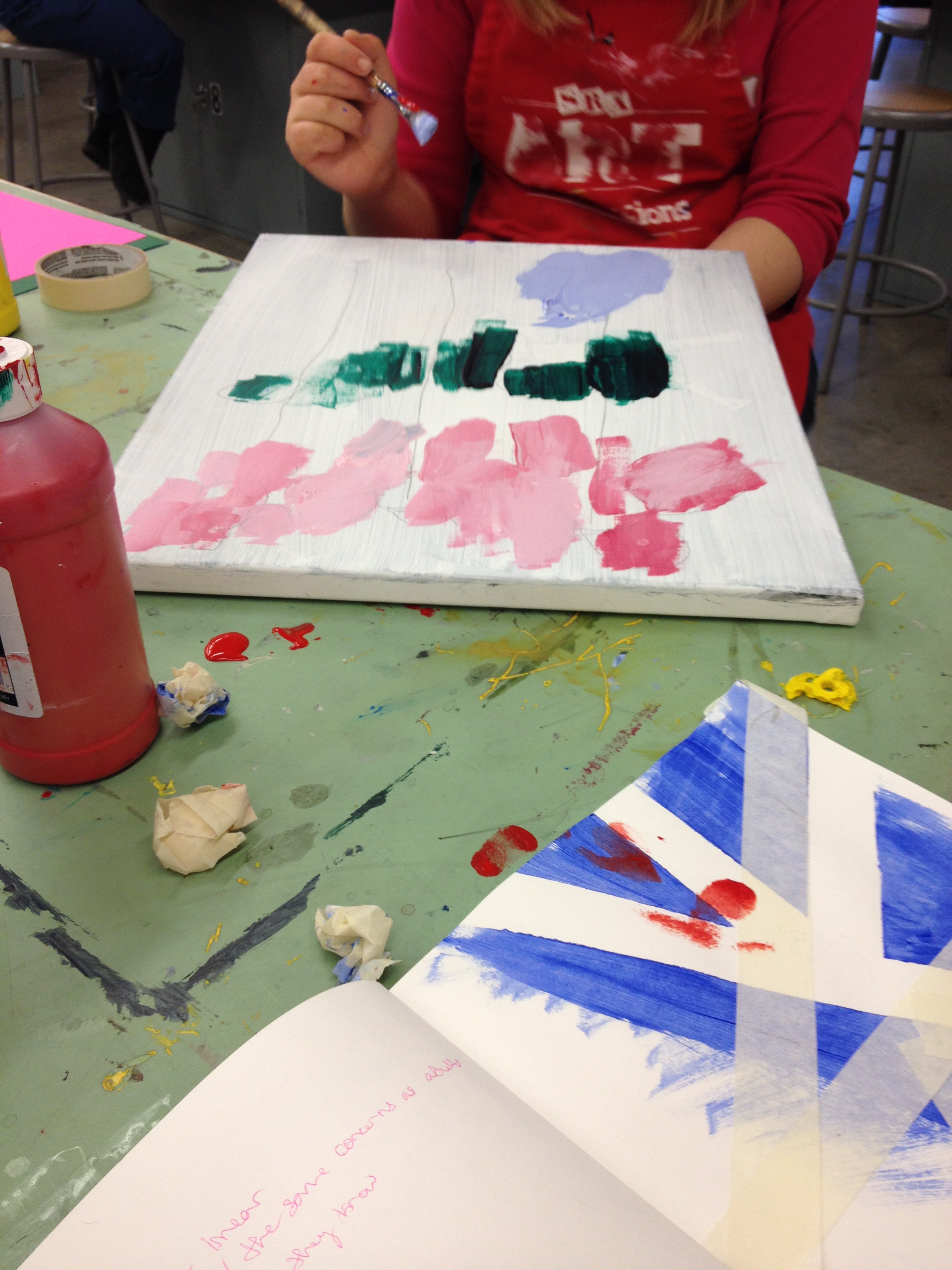
Ashley originally wanted to start painting pink, and verbally described/ questioned how to go about making that color. Nick told her that if she added a little blue it would make Lavender.
Ashley’s first attempt at mixing was more of a dark blue-purple. I asked her what she thought happened that made it dark instead of lavender? Ashley determined that she had added too much blue, and not enough red or white. After asking her how to proceed mixing the color again, Ashley determined that using a smaller brush would help her to use smaller amounts of paint. Ashley started by mixing a regular amount of pink, and then used her small brush to add tiny amounts of blue until she achieved the shade of lavender she wanted.
In the video, Ashley is removing the tape to see her final project! Ashley has discovered that where there was tape no paint will be on the paper! She loves the straight lines it created. This discovery is part of understanding step by step process, and cause and effect.
Nick talks about Primary and Secondary colors:
Nick Mixes Copper:
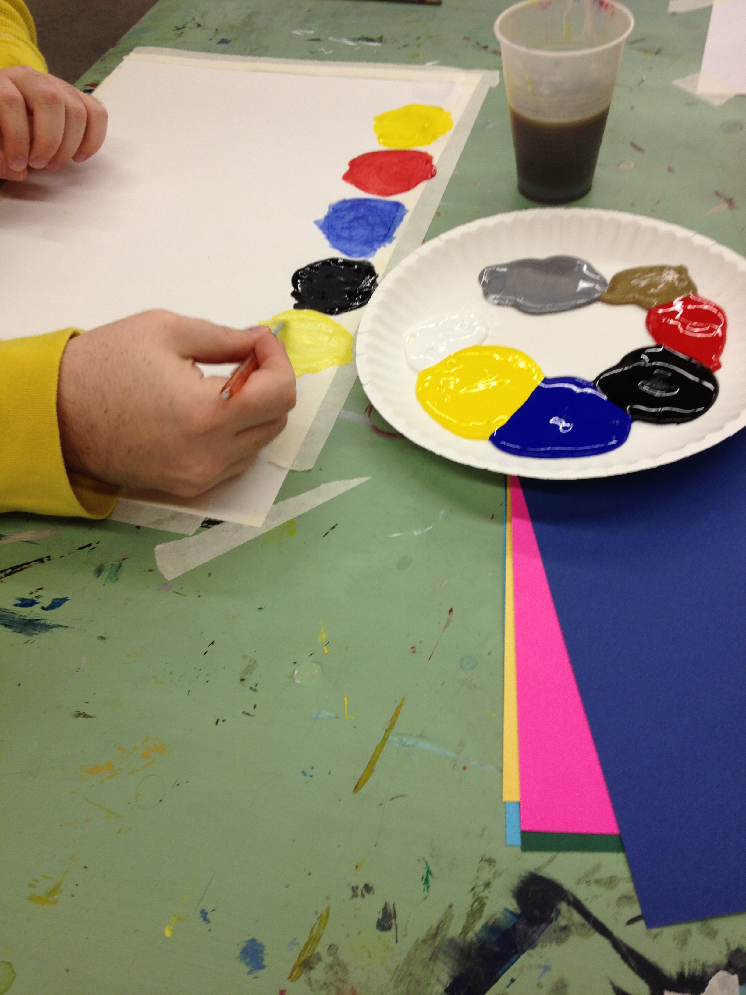
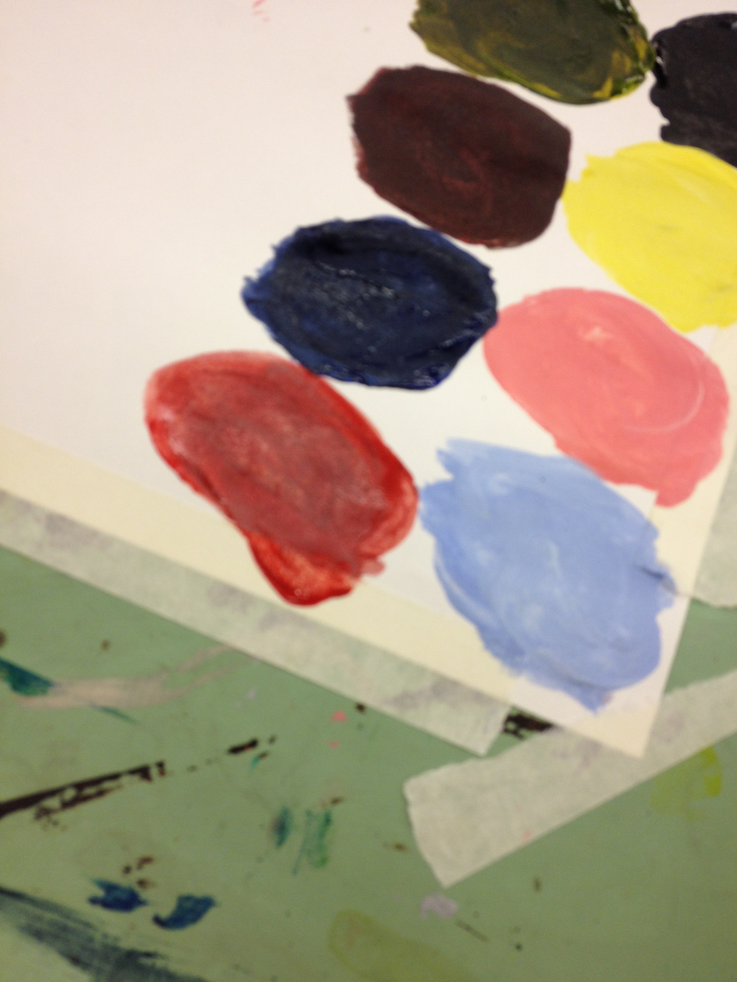
Nick’s next experiment was to add white to all of his primary colors, and then displaying them along the top of his painting.
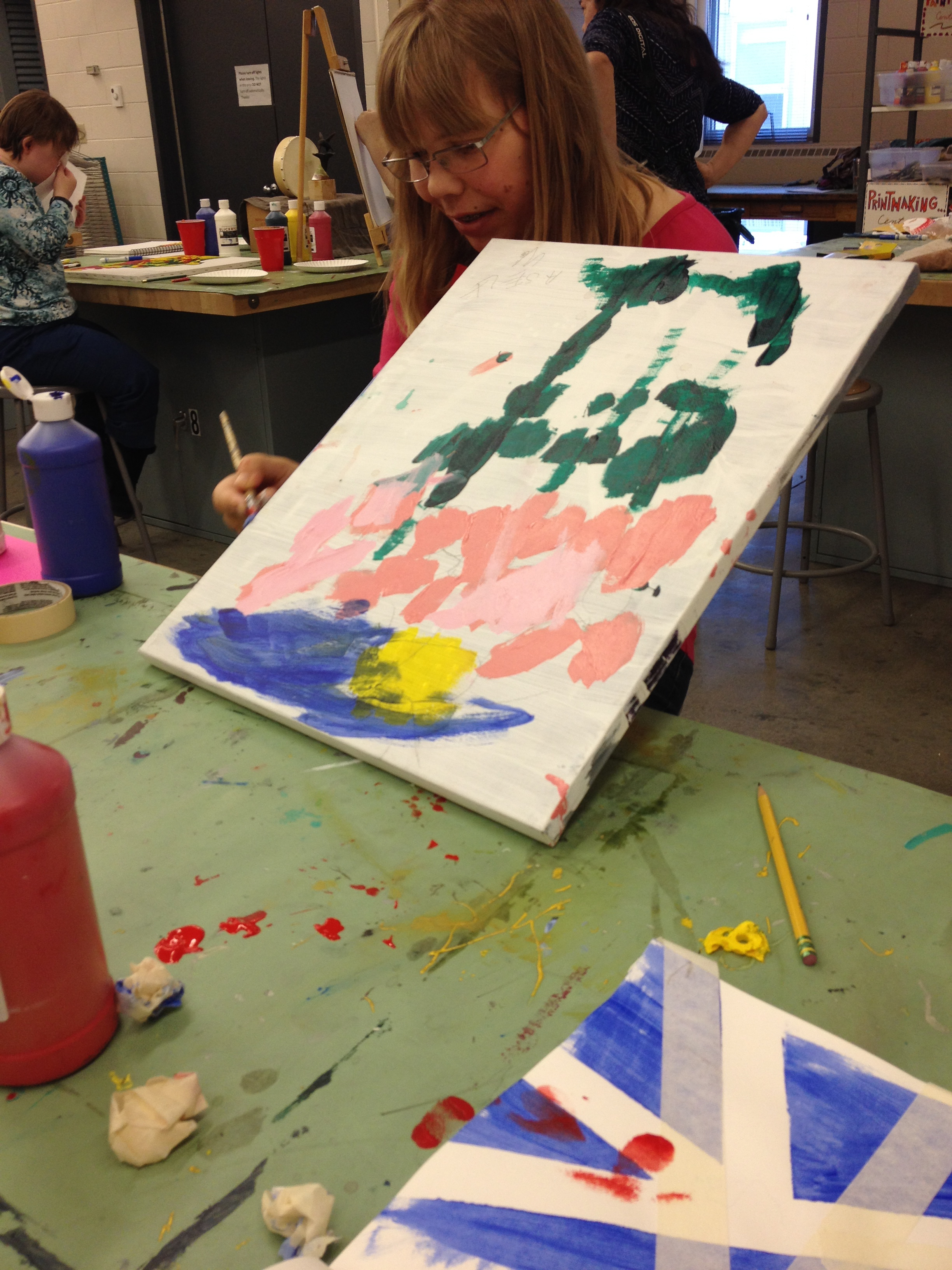
After her tape-resist painting, Ashley worked on her flower composition. We stood back from it and brainstormed how it could be improved. Ashley noticed that there was a lot of empty space, and that if it was filled up it may look even more interesting. Ashley thriftily decided to use her left over blue and white paint to fill the space.
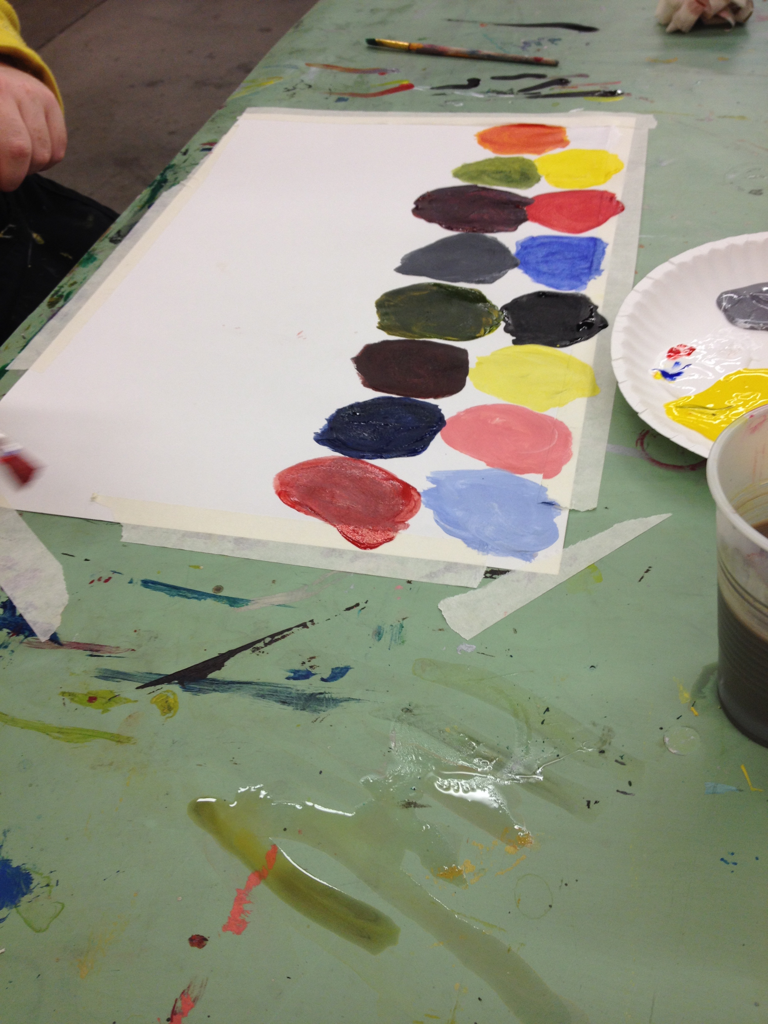
Nick continued his color mixing, continuing in a line of circles
Nick is demonstrating one of Rhoda Kellogg’s stages of art making, the aggregates stage. This means he is using multiple diagrams (shapes) and arranging them not in a hodge-podge form, but in the design he finds most balanced and pleasing.
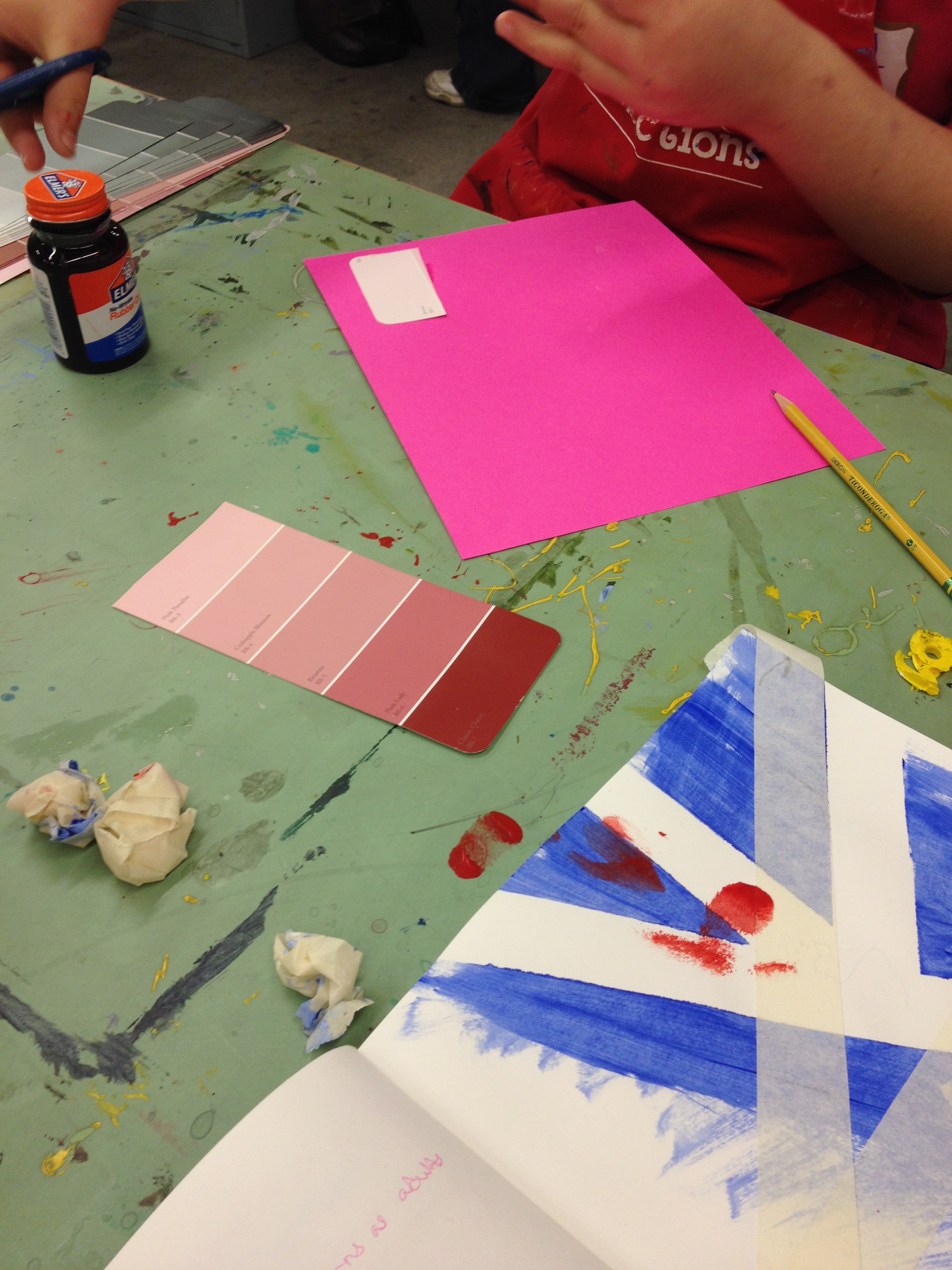
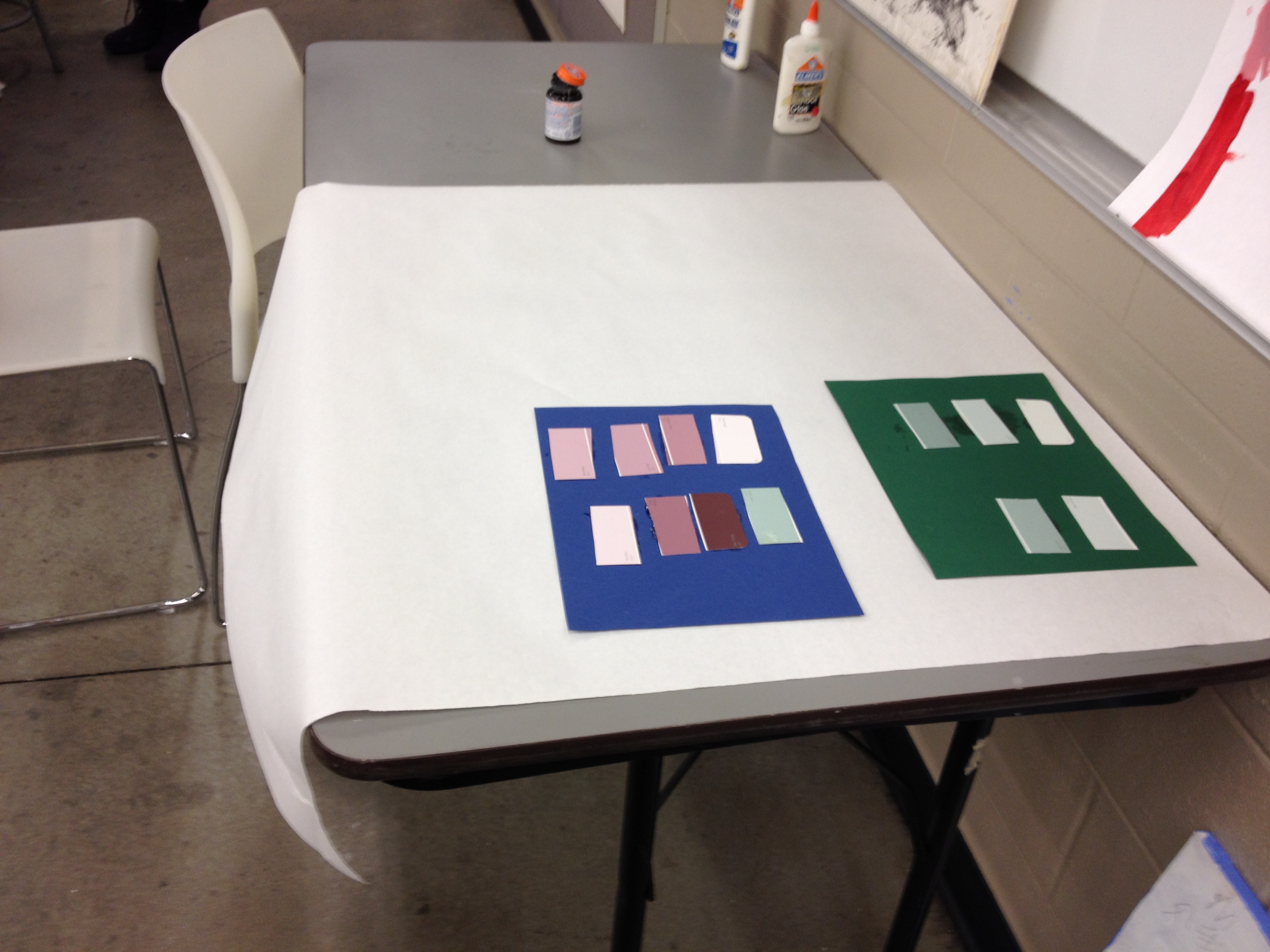
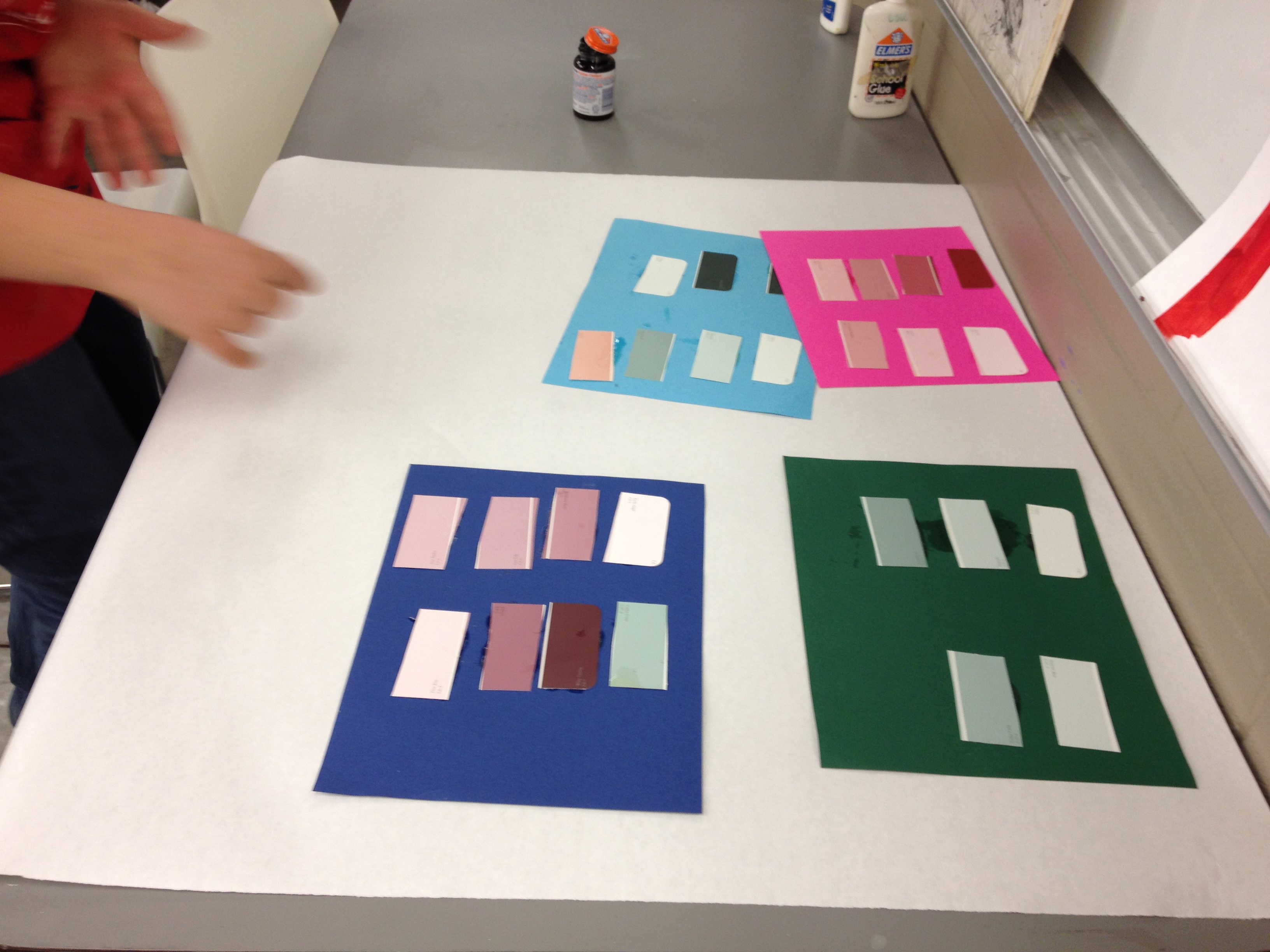
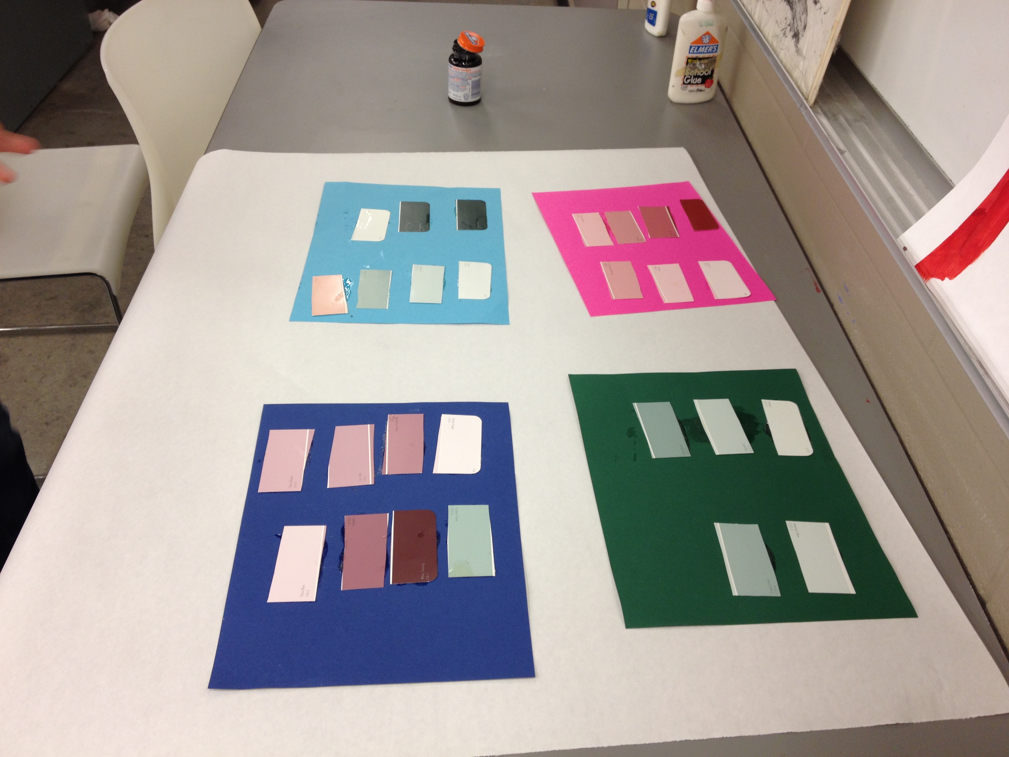
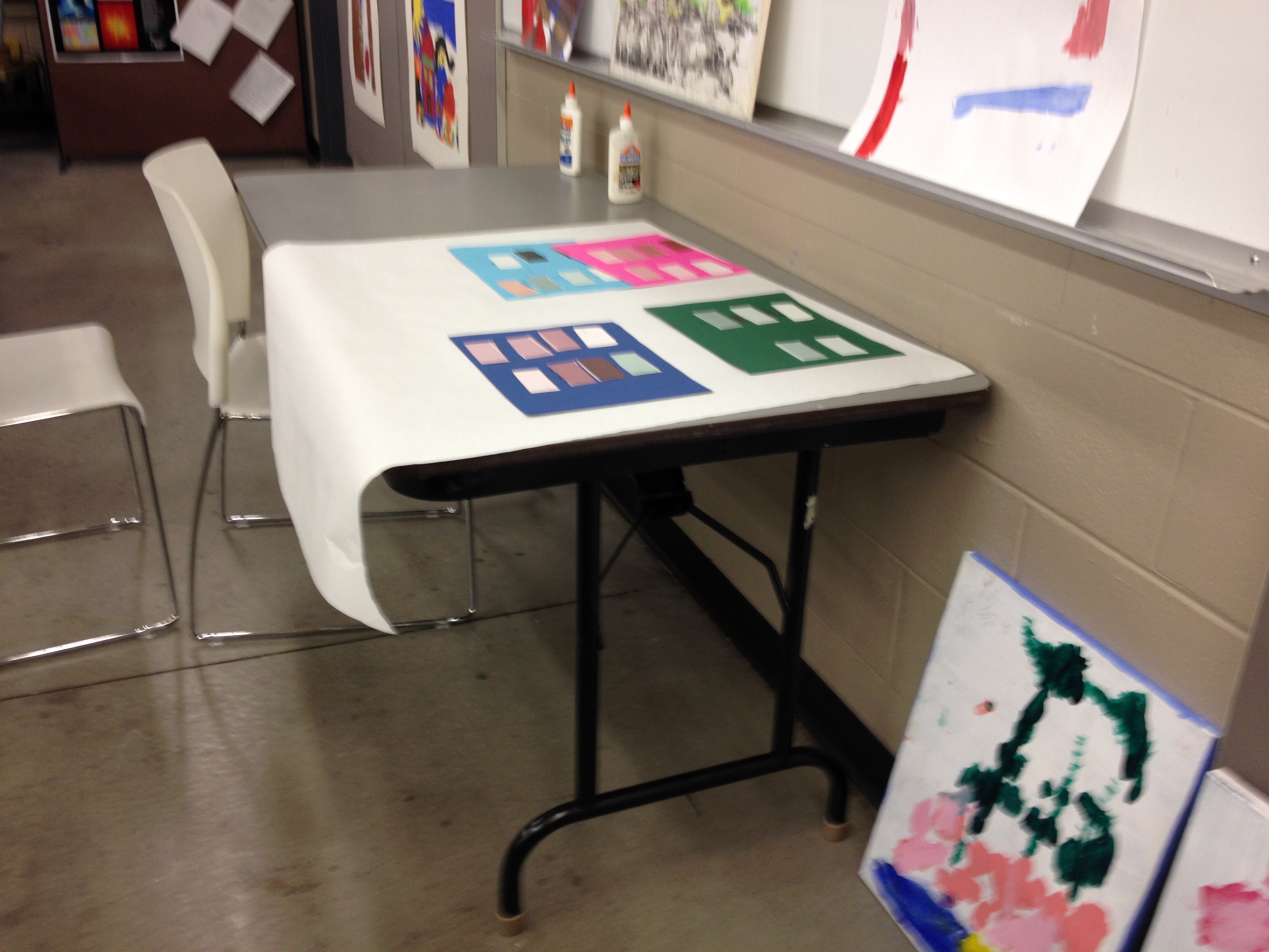
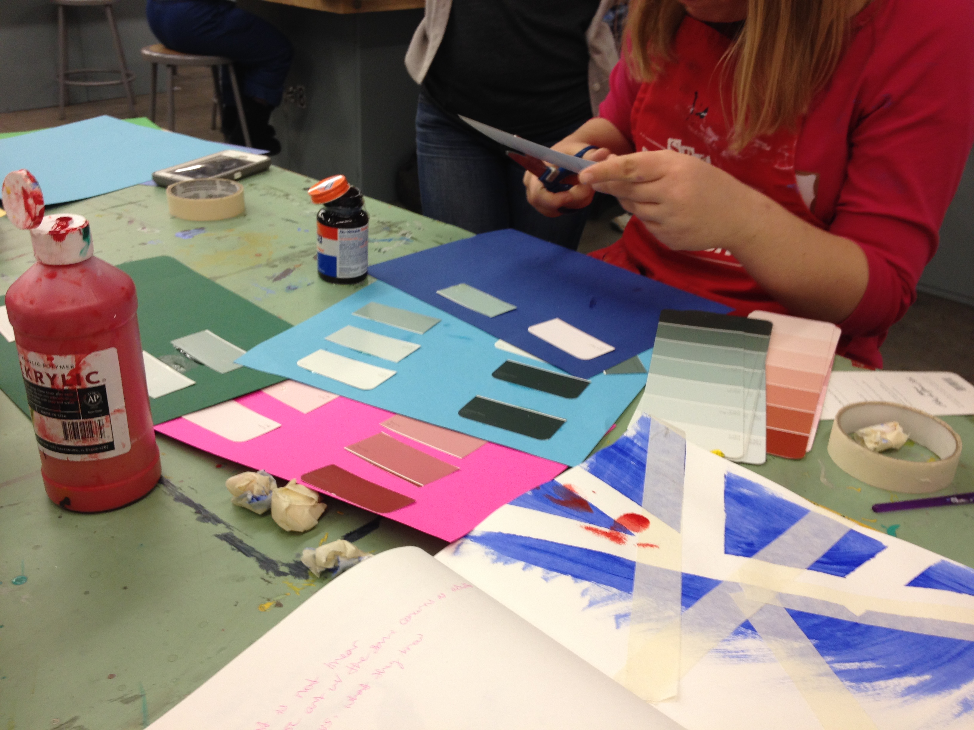
While waiting on her paint to dry, Ashley was drawn back to collaging with paint chips.
Ashley specifically chose colors she used in her tape-resist painting, pinks and lavenders, to connect the two together, stating that the two works “would go together.”
In the video, Ashley describes the pattern she is creating with paint chips. As she says, her artwork is “the Bomb.Com.”
I enjoy allowing the students to gravitate away from the planned project and follow their interests, for example, Ashley usually works on 2-3 different art projects in a class, and Nick often interprets the lesson in his own way. Allowing for this flexibility lets students construct their own meaning in art and work on things relevant to them.
Ashley then branched out to other variation of colors
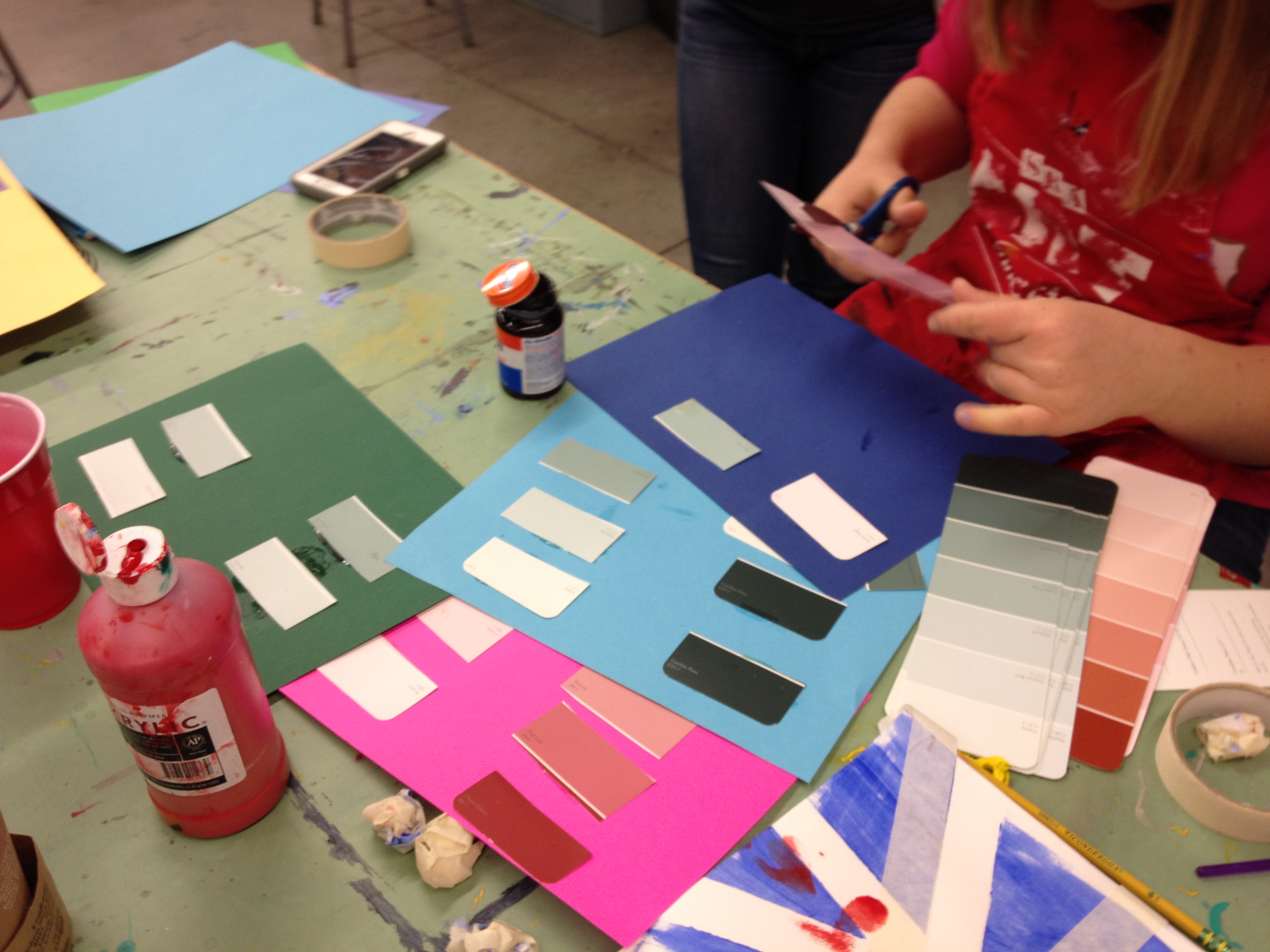
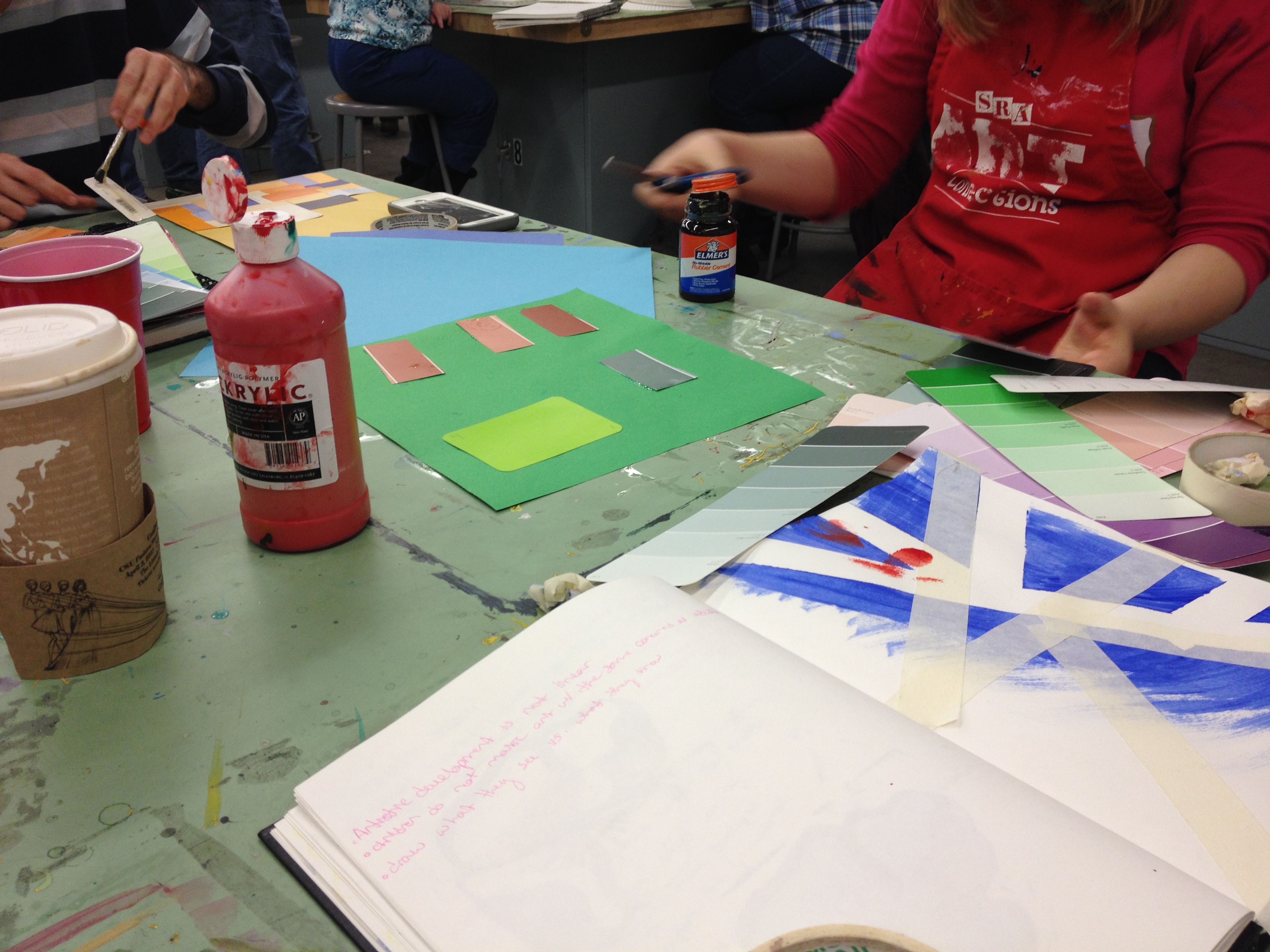

Ashley chose colored sheets of paper and paint chips of colors that she believed to compliment and stand out with the paper.
We then discussed making one big collage out of them on a large piece of paper. Next class, she plans on layering more colors on the sheet.
Nick filled his entire paper with mixtures of primary colors. Nick took the main project of the assignment and tweaked it to follow his own attention to detail and love of colors.
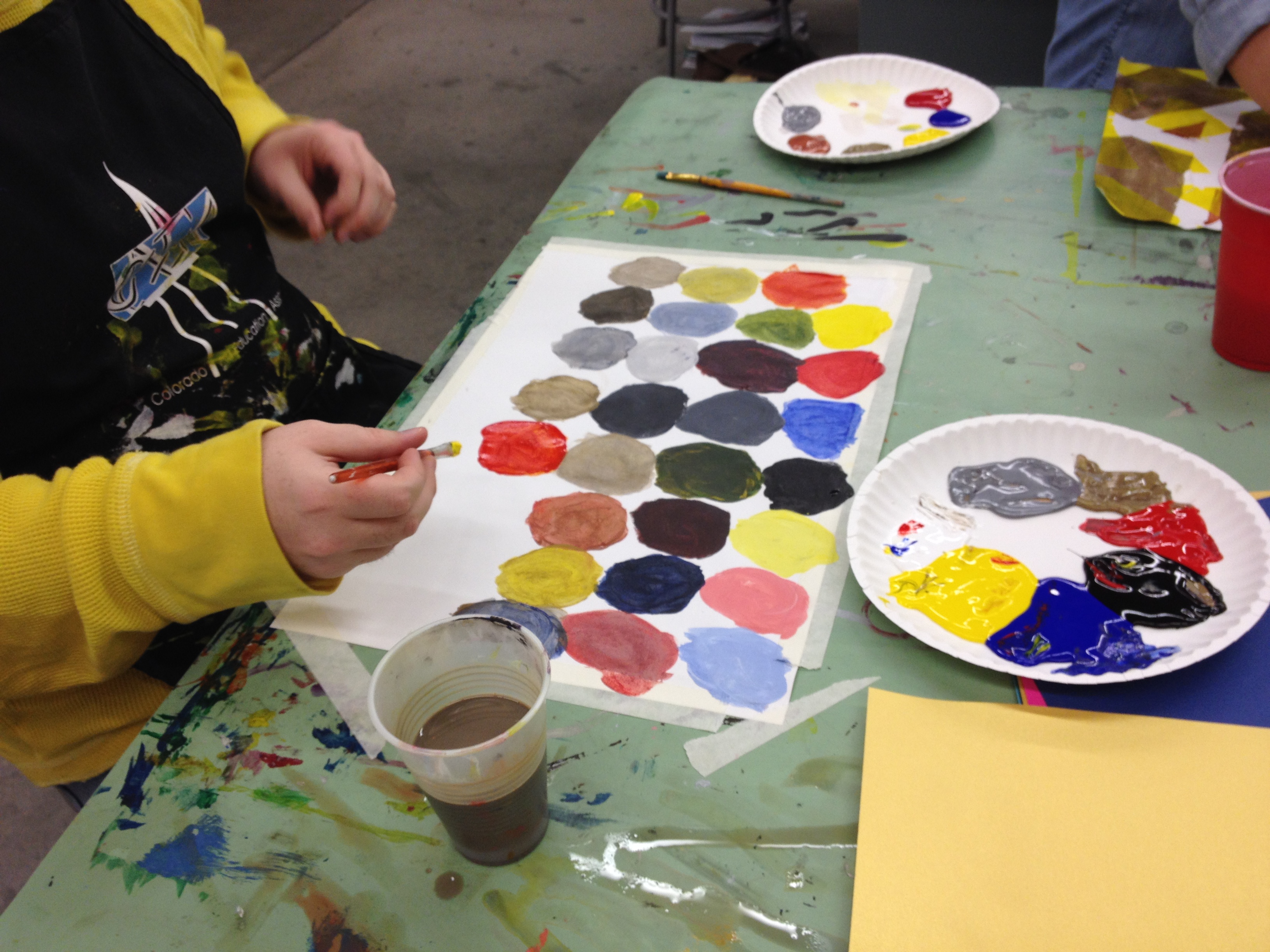
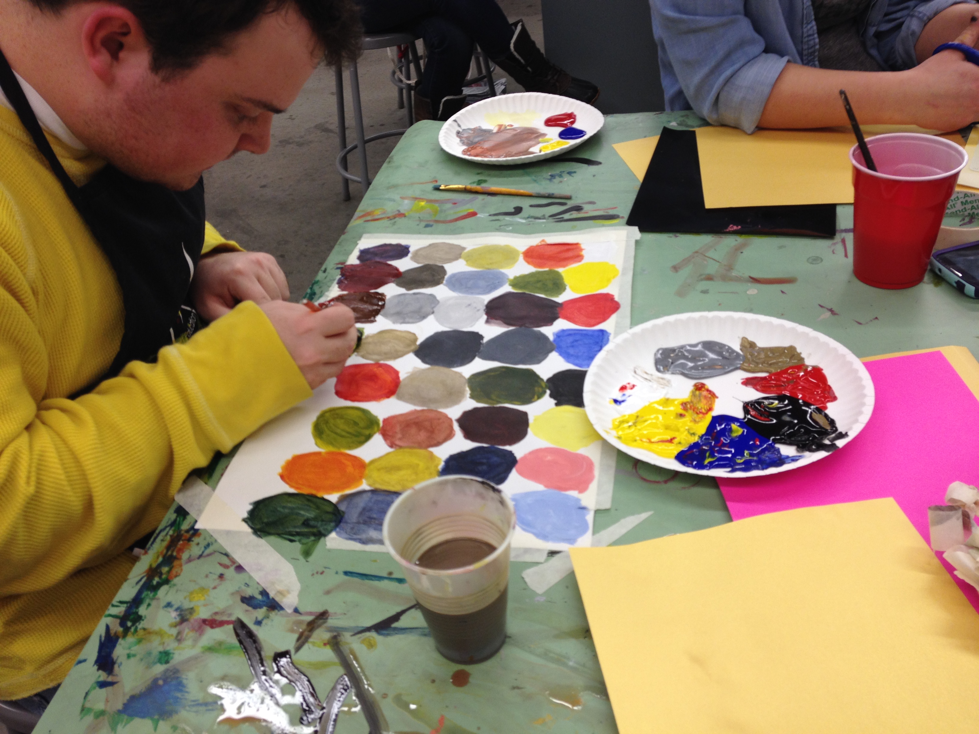
In the video, Nick is listing the names of all the colors he made. Nick chose to only use primary colors (red, yellow, and blue), black, white, silver, and gold to mix his colors. He came up with an impressive array. As Nick lists his colors, he is demonstrating Koster’s artistic definition of art stating that art is graphic, verbal, and kinesthetic.
